
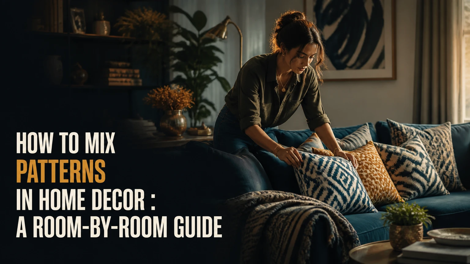
To mix patterns in home decor in the USA, choose one connected color palette, vary pattern scale, combine different motif families, and separate busy surfaces with solids and texture. Start with one large anchor pattern, add a medium pattern and a small pattern, then check the room from the main entry and seating positions.
Key Facts at a Glance
Three patterns are a reliable starting point for a sofa, bed, or compact room grouping.
Pattern harmony depends more on shared color, different scale, and controlled visual weight than on identical motifs.
A practical room often contains approximately 60% solid or quiet surfaces and 40% visible pattern.
Large motifs belong on broad surfaces, while small prints work best on cushions, trims, and compact accents.
Typical USA costs range from $50-$150 for a pillow refresh, $800-$2,500 for a single-room update, and $5,000-$15,000 or more for extensive custom work.
The commonly repeated “2-inch rule” is not a universal design standard; visible scale contrast matters more than a fixed measurement.
What Does Pattern Mixing Mean in Home Decor?
Pattern mixing means intentionally combining two or more visual motifs in one room while controlling their color, scale, direction, and visual weight. Stripes, florals, plaid, checks, paisley, ikat, animal prints, abstract marks, and geometric grids can coexist when the room provides a recognizable relationship between them.
A successful combination creates rhythm without making every surface compete. The eye usually needs a dominant pattern, a supporting pattern, and quieter areas that allow both designs to register clearly. A large floral rug, medium plaid chair, and narrow striped cushion create more order than three medium-scale florals placed beside one another.
Pattern is only one part of the composition. Solid upholstery, wood, metal, woven baskets, plain walls, and unpatterned bedding act as visual pauses. Texture also matters: a nubby cream throw can calm a patterned chair even when both pieces have strong physical presence.
How Does Pattern Mixing Create Visual Balance?
Pattern mixing creates balance through four controls: shared color, contrasting scale, varied motif shape, and repeated placement. Shared color helps the brain group separate designs, while scale contrast prevents adjacent patterns from competing at the same visual distance.
Visual weight depends on more than motif size. Dark backgrounds, high contrast, dense marks, glossy fabric, and large uninterrupted surfaces all make a pattern feel heavier. A small black-and-white geometric print may attract more attention than a larger low-contrast botanical design.
Use sightlines as a practical test. Stand at the room entrance, then sit in the primary chair or on the bed. If one pattern dominates from both positions and the others remain legible, the hierarchy is working. If every print appears equally loud, remove one pattern or replace it with a solid texture.
What Is the Most Reliable Pattern Formula?
The most reliable beginner formula is one large pattern, one medium pattern, one small pattern, and two or more solid surfaces. The three designs should share at least one color, but they should not repeat the same shape at the same scale.
The rule of three applies best to a grouping, such as a sofa with pillows or a bed with shams and a lumbar cushion. It does not mean an entire open-plan home must contain only three patterns. A living room, dining area, and hallway can each have their own pattern hierarchy if a repeated color or material connects them.
| Formula element | Typical location | Recommended visual role | Example |
|---|---|---|---|
| Large anchor | 8-by-10-foot rug or 96-inch curtain panel | Dominant field | 12-inch navy botanical leaves |
| Medium support | Accent chair or 20-inch pillow | Contrast and rhythm | 4-inch rust plaid |
| Small accent | Lumbar pillow or trim | Detail and transition | 1-inch cream pinstripe |
| Quiet surface | Sofa, wall, or plain throw | Visual rest | Solid oatmeal upholstery |
| Material bridge | Wood, rattan, or brushed metal | Repeated texture | Medium walnut side table |
How Do You Choose a Pattern Color Palette?
Choose the palette before shopping by identifying one background neutral, one primary color, and one or two supporting accents. A pattern does not need to match every item exactly, but repeating one exact or closely related color across designs makes the room easier to coordinate.
Check undertones before buying. Warm ivory, camel, terracotta, and walnut usually sit comfortably together, while blue-white, cool gray, and silver create a different visual temperature. A bright optic white pillow can make an aged ivory rug look yellow even when both products are described as “white.”
Lay fabric samples, rug images, paint cards, and furniture photographs together in natural daylight. Online product photography varies by retailer, so request swatches for custom upholstery, drapery, wallpaper, and expensive rugs.
| Palette framework | Colors used | Typical pattern count | Best room application |
|---|---|---|---|
| Monochromatic navy | Navy, pale blue, white | 3-5 | Bedroom or study under 180 square feet |
| Warm neutral | Ivory, camel, rust, walnut | 3-4 | Living room with wood furniture |
| Analogous green | Sage, olive, blue-green, cream | 3-5 | Sunroom or casual dining area |
| High contrast | Black, white, ochre, muted green | 2-4 | Contemporary living room over 200 square feet |
| Heritage palette | Burgundy, moss, tan, aged ivory | 3-6 | Traditional room with antique or vintage pieces |
Should Every Pattern Share a Color?
Every pattern should usually share one color with another visible element, but forcing one exact color into every print can make the room feel manufactured. A quieter transition piece, such as a cream-and-tan stripe, can connect a colorful floral to a darker geometric without repeating every accent.
Use the 70% test: place the proposed pattern beside the anchor and view both from about 10 feet away. If the background value and one secondary color relate at that distance, the combination may work even when the motifs differ.
Which Pattern Types Pair Well Together?
Linear patterns pair well with organic motifs because straight lines provide structure while curved forms provide movement. Cultural patterns, such as ikat, kilim, Suzani, and batik, work best beside simpler stripes, dots, or quiet checks that allow their irregular details to remain visible.
Novelty prints require restraint. Leopard, chinoiserie scenes, expressive abstracts, and large animal motifs often need solid upholstery or a muted plaid nearby rather than another high-contrast statement design.
| Pattern family | Visual behavior | Strong companion | Common risk | Suitable surface |
|---|---|---|---|---|
| Stripe or grid | Linear, directional, structured | Loose floral or paisley | Too many competing directions | Drapery, cushion, headboard |
| Floral or botanical | Curved, flowing, dense | Plaid or narrow stripe | Similar-scale print collision | Rug, wallpaper, chair |
| Plaid or check | Repeating, grounded, orderly | Ikat or organic leaf | Overly formal repetition | Ottoman, chair, bedding |
| Ikat or kilim | Irregular, textural, global | Small dot or solid stripe | Competing cultural motifs | Rug, pillow, stool |
| Animal print | High contrast, conversational | Solid velvet or muted check | Visual overload | Small cushion, bench |
| Abstract geometric | Graphic, directional, modern | Soft botanical or plain weave | Hard, disconnected palette | Art textile, rug, pillow |
What Should You Use as the Anchor Pattern?
Use the broadest visible surface as the anchor when that surface already exists, such as a rug, wallpaper, sofa, or curtain. When purchasing from scratch, an area rug is often the easiest anchor because its color field can coordinate furniture and smaller accessories without committing every wall to a motif.
Large patterns need sufficient viewing distance. A 10-inch leaf repeat may look elegant on a rug viewed across a 12-foot room but appear crowded on a 20-inch pillow. Motif scale must match the object’s dimensions and the distance from which the object is normally seen.
How to Mix Patterns in Home Decor in USA, Step by Step
The following seven-step process works for a living room, bedroom, office, or dining space. Plan 1-3 hours for selection, allow 2-8 weeks for typical USA retail delivery, and let the anchor pattern determine the palette and scale hierarchy.
Step 1: Inventory Existing Patterns
List every patterned item that will remain, including flooring, rugs, upholstery, window treatments, bedding, tile, artwork, and permanent wallpaper. Photograph each item in daylight and note its background color, dominant hue, motif size, and direction.
Do not begin with a shopping cart. Begin with the room’s fixed visual information.
Success checkpoint: You can identify the existing anchor, even if it is an unwanted one.
Common mistake: Treating artwork as exempt because it is mounted on a wall. Large art can carry as much visual weight as a chair or rug.
Step 2: Establish One Color Story
Select a neutral background, a main color, and one or two accents from the existing room. Use paint chips or fabric samples rather than memory, because beige, gray, white, and blue each have warm and cool variations.
For a beginner living room, a workable example is warm ivory, muted navy, terracotta, and walnut. The same palette can appear as a botanical rug, a navy stripe, and a small terracotta check.
Success checkpoint: Each planned pattern shares a background value or a recognizable color with at least one other item.
Common mistake: Matching colors only on a phone screen, where brightness and color temperature can be inaccurate.
Step 3: Select the Large Anchor
Choose one large-scale design for the rug, curtains, wallpaper, upholstered chair, or duvet cover. The anchor should contain the strongest color relationship and occupy enough surface area to establish direction.
Large botanical, low-contrast geometric, medallion, and broad plaid designs are common anchors. Avoid placing a dense, high-contrast anchor on both the floor and the largest upholstered item unless you are deliberately creating a maximalist room.
Success checkpoint: The anchor remains the first or second thing you notice from the doorway.
Common mistake: Selecting a large pattern only because its sample looks attractive at 12 inches away.
Step 4: Add Medium and Small Patterns
Add a medium pattern from a different family, then a small pattern with tighter spacing. A floral anchor can take a medium windowpane check and a small stripe; a geometric rug can take a medium leaf pillow and a tiny dotted lumbar cushion.
The often-cited 60-30-10 pattern distribution is a useful visual hierarchy, not a literal requirement that exactly 60% of the room be patterned. A more practical interpretation is 60% dominant or quiet field, 30% supporting pattern or color, and 10% small accent detail.
Success checkpoint: The three designs remain distinguishable from 8-10 feet away.
Common mistake: Choosing three patterns with identical motif density, because the eye reads them as one continuous argument.
Step 5: Insert Solid and Textured Surfaces
Place solids between patterns on the same plane. On a sofa, a solid cushion can separate a floral pillow from a geometric pillow; on a bed, a plain duvet can separate patterned shams from a printed lumbar cushion.
Aim for approximately 60% solid or visually quiet surfaces and 40% visible pattern in a conventional room. Dense maximalist rooms can exceed that pattern share, but they need stronger control over value, spacing, and furniture shape.
Success checkpoint: At least one quiet surface appears in every major sightline.
Common mistake: Using a solid color with a shiny finish, which may still attract attention like a pattern under direct lighting.
Step 6: Repeat Patterns Across the Room
Repeat a pattern, color, or motif at least twice when the room is large enough to support repetition. A rust tone in the rug can recur in a cushion; a narrow stripe can appear on a lampshade and an ottoman.
Repetition creates visual rhythm, but exact duplication can look staged. Change the scale or material when repeating a motif so the room feels related rather than catalogued.
Success checkpoint: The eye travels between separate areas instead of stopping at one isolated print.
Common mistake: Concentrating every pattern on the sofa while leaving the opposite side of the room visually empty.
Step 7: Edit From Multiple Viewpoints
Remove one item before adding another. View the room from the doorway, primary seat, adjacent hallway, and evening lighting conditions, then assess pattern hierarchy at each position.
Patterns that look balanced in a product collage can clash when they sit on adjacent planes. Curtains may compete with a rug, while a pillow that looked loud in the store may disappear against a patterned sofa.
Success checkpoint: You can name the dominant, supporting, and accent patterns without hesitation.
Common mistake: Evaluating objects individually rather than judging their combined effect from normal living positions.
How Should Patterns Be Distributed by Room?
Pattern distribution should follow the room’s largest surfaces, viewing distance, and practical use. Living rooms can support a rug, upholstery, and cushions, while small bedrooms often need one patterned textile plus two quiet supporting surfaces.
| Room | Large pattern location | Medium pattern location | Small pattern location | Typical solid share |
|---|---|---|---|---|
| Living room | 8-by-10-foot rug | 30-inch chair or ottoman | 18-by-18-inch cushions | 55%-65% |
| Bedroom | 90-by-96-inch duvet or rug | 26-inch shams | 14-by-24-inch lumbar pillow | 60%-70% |
| Dining room | 8-by-10-foot rug | 18-inch seat fabric | 16-inch runner detail | 60%-75% |
| Home office | 5-by-8-foot rug or curtains | 24-inch chair | 12-inch cushion or art print | 65%-80% |
| Small entry | 2.5-by-8-foot runner | 18-inch bench cushion | 12-inch accessory | 70%-85% |
How Do You Mix Patterns in a Living Room?
Use the rug or largest upholstered item as the anchor, then place the second pattern on a chair, curtains, or two pillows rather than covering every seat. A practical living room arrangement is a low-contrast botanical rug, a medium rust plaid chair, a narrow navy stripe cushion, and solid cream sofa upholstery.
Keep directional patterns aligned with the architecture. Vertical stripes can emphasize ceiling height, while horizontal stripes can visually widen a narrow seating wall. In an open-plan space, repeat one color in the dining or kitchen zone instead of carrying every living-room pattern across the entire floor plan.
How Do You Mix Patterns in a Bedroom?
Begin with either the duvet or the headboard, not both, unless one design is very quiet. Layer patterned shams, a solid coverlet, and a small lumbar print so the bed has a clear foreground, middle ground, and background.
Washability and comfort limit bedroom choices. Place rough kilim or heavily embellished fabric on a bench or decorative cushion rather than directly against the face, and check care labels before combining dry-clean-only textiles with machine-washable bedding.
Can You Mix Patterns in a Small Room?
Small rooms can mix patterns successfully when they use fewer high-contrast surfaces and repeat a narrow palette. Choose one medium or large pattern, one small accent, and quiet walls or upholstery; three competing large motifs can make a 100-square-foot room feel compressed.
Use low-contrast designs on broad surfaces and reserve dark or graphic patterns for portable items. This approach preserves flexibility because cushions and throws can change without replacing a rug or window treatment.
Which Pattern-Mixing Framework Should You Choose?
Monochromatic pattern mixing is the lowest-risk approach, a stripe foundation is the easiest place to begin, and high-contrast mixing suits experienced decorators who can control value and scale. The best framework depends on room size, tolerance for visual energy, and the patterns already present.
| Framework | Color condition | Scale condition | Typical risk | Best user |
|---|---|---|---|---|
| Monochromatic | 1 hue plus white or neutral | 3 distinct scales | Flatness from weak texture | Risk-averse beginner |
| Stripe foundation | 1 stripe plus 1 organic motif | Wide stripe with smaller print | Formal appearance | Transitional room owner |
| Analogous palette | 2 neighboring hues | Large, medium, small | Muddy undertones | Traditional decorator |
| High contrast | Black or deep neutral plus 2 accents | Strongly separated motifs | Competing focal points | Eclectic maximalist |
| Pattern drenching | One motif family across walls and fabric | Repeated scale changes | Enclosure and fatigue | Large room with strong editing |
Pattern drenching is not ideal for a rental, a low-light room, or a space with many permanent finishes. It requires confident color control and enough negative space to prevent the room from becoming visually dense.
What Does Pattern Mixing Cost in the USA?
Typical USA pattern-mixing costs range from $50-$150 for new pillow covers to $5,000-$15,000 or more for extensive custom upholstery, wallpaper, and window treatments. Shipping, fabric grade, installation, regional labor, and custom dimensions create larger price differences than pattern complexity alone.
| Project scope | Typical USA cost | Typical timeframe | Main purchases |
|---|---|---|---|
| Pillow refresh | $50-$150 | 1-2 hours to select, 1-4 weeks to receive | 3-4 covers and one throw |
| Rug and textile update | $300-$1,200 | 1-4 weeks | 5-by-8 or 8-by-10 rug, pillows, throw |
| Single-room mid-range update | $800-$2,500 | 2-8 weeks | Rug, curtains, chair, cushions |
| Custom drapery | $1,000-$4,000 | 6-12 weeks | Fabric, lining, fabrication, installation |
| Wallpaper and upholstery project | $5,000-$15,000+ | 2-4 months | Wallpaper, labor, custom furniture, trims |
These are typical planning ranges, not fixed national prices. A designer in New York, Los Angeles, Seattle, or Washington, DC may charge more for consultation and installation than a provider in a lower-cost market, while online retailers may reduce selection costs but increase return and shipping risk.
What Are the Most Common Pattern-Mixing Mistakes?
The most common failures are equal-scale patterns, unrelated undertones, excessive high contrast, and missing quiet surfaces. Each problem can usually be corrected without replacing the entire room by changing one pattern, adding a solid transition, or moving the dominant print to a less competitive location.
- Three patterns have the same scale. Replace one with a micro-stripe, small dot, or tight herringbone.
- The background whites do not match. Use ivory, cream, or bright white consistently across nearby textiles.
- Every pattern is high contrast. Keep one strong design and choose two lower-contrast companions.
- Patterns point in conflicting directions. Limit vertical, horizontal, and diagonal movement to one dominant direction per sightline.
- The room lacks solids. Add an unpatterned throw, plain shade, solid cushion, or quiet upholstery.
- The anchor is too small. Move the strongest pattern onto a rug, curtain, or larger upholstered surface.
- The pattern works close up but fails at distance. Test samples from 8-10 feet away under daytime and evening light.
A fixed “2-inch rule” cannot solve these problems. Motif size changes with object dimensions, viewing distance, and contrast, so a two-inch difference may be invisible on a large rug and excessive on a small cushion.
How Can You Adapt the Method to Different Situations?
Pattern mixing changes when the room has a rental restriction, an open floor plan, pets, children, low light, or an existing statement piece. Preserve the same hierarchy, but change where the pattern appears and how durable the materials need to be.
For a rental apartment
Use removable wallpaper, washable pillow covers, framed fabric, and a freestanding screen instead of permanent patterned upholstery or installed wallpaper. A 5-by-8-foot rug and three reversible cushions can establish a complete pattern story without altering walls.
For pets or children
Choose performance fabrics, indoor-outdoor rugs, removable covers, and medium-value backgrounds that disguise small marks. Avoid delicate fringe, loosely woven silk, and pale high-contrast floor patterns in high-traffic zones.
For a dark room
Use patterns with lighter backgrounds and moderate contrast rather than several deep, dense prints. Add texture through linen, boucle, cane, or matte cotton, because glossy dark textiles can absorb or reflect light unevenly.
For an open-plan home
Assign one anchor pattern to each functional zone, then repeat a shared neutral or accent color across zones. A living-room botanical rug and dining-room stripe can coexist when both include the same ivory and blue-green, even if their motifs never repeat.
What Are the Expert Rules That Matter Most?
Pattern scale must be judged in context, not from a fabric swatch. A print that appears small on a showroom card can become dominant when repeated across 120 square feet of curtains or wallpaper.
A pattern’s background often matters more than its motif. Two unrelated designs can coordinate when their background values match, while two similar florals can clash if one is bright white and the other is yellowed cream.
Solids are active design elements rather than empty space. A plain velvet cushion can have greater visual weight than a small print, so evaluate sheen, pile, darkness, and size alongside motif density.
Pattern mixing is also reversible when accessories carry most of the visual information. Renters and cautious buyers should place bold designs on covers, throws, small rugs, and framed textiles before committing to custom upholstery or wallpaper.
FAQ
Can you mix two different floral patterns in one room?
Yes, two florals can work when their scale, structure, and background differ. Pair a large loose botanical with a small, tightly spaced floral, then separate them with a stripe or solid textile. Two florals with identical density and similar colors often merge into visual noise, especially on adjacent cushions.
Should curtains match a patterned rug?
Curtains should coordinate with a rug rather than match it exactly. Repeat one rug color in the curtain background, border, or trim, but use a different motif and scale. If both surfaces have dense patterns, choose a low-contrast curtain so the room retains one clear anchor.
How many patterns are too many for one room?
Four to six visible patterns can work in a medium or large room when only one or two have strong contrast. A small room may feel crowded with three large, dark prints, while a large room with plain walls and solid upholstery can handle more accessory patterns.
Can furniture patterns be mixed with patterned wallpaper?
Patterned furniture can sit beside wallpaper when one design is quieter and the other controls the room’s scale. Use a medium or small upholstery print against large, low-contrast wallpaper, or reverse the relationship. Test full-size samples because wallpaper repetition changes substantially across a wall.
What is the easiest pattern combination for beginners?
A broad stripe, a soft botanical, and a small geometric are among the easiest combinations because they provide different line behaviors and clear scale contrast. Keep the palette to one neutral, one main color, and one accent, then place a solid textile between the designs.
Do all rooms in a house need the same patterns?
All rooms do not need identical patterns. A consistent neutral, wood tone, metal finish, or accent color can connect rooms while allowing each space to have a distinct motif. Repeating every pattern throughout a home usually creates a staged effect and limits future furniture choices.
The Bottom Line
To mix patterns in home decor in USA successfully, begin with the room’s existing anchor, establish a controlled color story, and combine large, medium, and small designs from different pattern families. Use solids and texture as deliberate pauses, test the arrangement from real viewpoints, and choose washable or removable pieces when flexibility matters.