
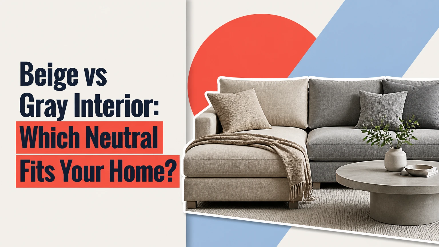
Beige is usually the better choice for a warm, relaxed interior with wood, leather, and soft natural light, while gray suits crisp contemporary rooms with strong contrast, white finishes, and controlled lighting. The best choice depends on the room’s window direction, fixed materials, undertones, desired atmosphere, and whether warmth or architectural sharpness matters more.
Key Facts at a Glance
- Beige contains warm undertones such as yellow, gold, red, pink, or brown; gray may contain blue, green, violet, beige, or no obvious undertone.
- Gray can make north-facing rooms feel cooler, while beige can become overly yellow beside warm lamps or golden wood.
- Greige combines gray and beige, but its appearance can shift substantially between daylight, LED lighting, and incandescent lighting.
- Light Reflectance Value, or LRV, describes how much usable light a color reflects; a high LRV does not compensate for blocked windows or dark finishes.
- Large sample boards viewed at several times of day are more reliable than small paint chips.
- Typical professional repainting for a three-bedroom home costs about $2,500-$6,000, excluding major repairs and furniture changes.
What Is the Difference Between Beige and Gray Interiors?
Beige interiors use warm neutral colors that visually connect with sand, linen, timber, leather, and natural fibers. Gray interiors use neutral or cool colors that create sharper separation between walls, white trim, black accents, stone, glass, and polished metal.
The distinction is not simply warm versus cool. Undertone determines whether a beige wall looks creamy, muddy, pink, or yellow, and whether gray looks refined, blue, green, purple, or almost beige. Two paint colors with similar lightness can therefore produce very different rooms.
| Attribute | Beige interior | Gray interior | Greige interior |
|---|---|---|---|
| Primary visual temperature | Warm | Cool to neutral | Warm-neutral |
| Common undertones | Yellow, gold, red, pink, brown | Blue, green, violet, black | Beige, taupe, muted green |
| Best material partners | Oak, walnut, leather, rattan | Marble, chrome, black metal, glass | Oak, limestone, brushed brass |
| Typical atmosphere | Comfortable and grounded | Clean and structured | Adaptable and subdued |
| Main failure | Yellow or dated appearance | Cold or institutional appearance | Muddy or mauve appearance |
How Do Undertones Change the Result?
Undertones determine how a neutral relates to nearby colors. A beige with strong yellow undertones may look balanced beside cream upholstery but noticeably orange beside blue-white quartz. A gray with violet undertones can look elegant beside cool marble yet appear lavender beside warm oak.
Hold paint samples beside the floor, countertop, cabinet, and largest upholstered item. The surrounding material matters more than the paint name.
Beige vs Gray Interior: Master Comparison
A beige interior generally wins for comfort, warm wood, traditional architecture, and rooms that need a softer visual temperature. A gray interior generally wins for contemporary architecture, high-contrast schemes, cool stone, and rooms where furniture or artwork should provide the color.
| Decision criterion | Beige | Gray | Practical winner |
|---|---|---|---|
| Warmth | High, especially with yellow or brown undertones | Low to medium, depending on undertone | Beige |
| Compatibility with honey oak | Usually strong | Often difficult without warm gray | Beige |
| Compatibility with white marble | Strong with pale beige | Strong with neutral or cool gray | Depends on stone undertone |
| Contemporary contrast | Medium | High | Gray |
| North-facing room | Warm beige offsets blue light | Warm gray only | Beige |
| South-facing room | May become yellow | Gray can control excess warmth | Gray |
| Scuff visibility | Medium on light beige | Medium, lower on mid-tone gray | Tie |
| Risk of looking dated | High with yellow-orange beige | High with blue-gray | Tie |
| Texture requirement | Needs woven or contrasting textures | Needs wood or warm textiles | Neither |
Which Atmosphere Does Each Color Create?
Beige supports visual softness because warm undertones reduce the apparent contrast between walls, upholstery, and wood. Gray creates visual structure because its lower warmth makes white, black, saturated artwork, and architectural lines appear more distinct.
Gray is not automatically sophisticated, and beige is not automatically traditional. A pale mushroom beige with simple furniture can look contemporary, while a blue-gray room with ornate molding can look historic.
Which Beige Variation Should You Choose?
The best beige depends on undertone, light intensity, and surrounding materials. Honey beige suits traditional rooms with dark wood, oatmeal and linen beige suits organic modern rooms, and bone or ivory beige suits spaces that need a pale neutral without strong yellow.
| Beige family | Typical undertone | Suitable room | Pair with | Main risk |
|---|---|---|---|---|
| Honey beige | Gold and yellow | Dining room or historic home | Walnut, bronze, cream | Orange cast |
| Oatmeal | Sandy brown and muted gray | Bedroom or living room | Linen, oak, jute | Dullness in low light |
| Linen | Pale beige and soft gray | Coastal or organic modern room | White oak, cotton, stone | Washed-out appearance |
| Bone | Cream and restrained yellow | Hallway or low-light room | Warm white, brass | Too close to trim |
| Ivory | Cream with minimal brown | Kitchen or formal room | Marble, oak, black accents | Yellow beside blue-white surfaces |
Oatmeal and linen are often safer than strong golden beige because their muted undertones tolerate more furniture and flooring combinations. Honey beige remains useful where the room already contains warm wood and aged metal.
Which Gray Variation Should You Choose?
The best gray depends on whether the room needs depth, brightness, or warmth. Charcoal creates drama, slate gray creates cool contrast, and warm French gray softens the clinical quality associated with blue-gray paint.
| Gray family | Typical undertone | Best application | Pair with | Main risk |
|---|---|---|---|---|
| Charcoal | Black with blue or neutral base | Accent wall or media room | Oak, leather, brass | Visually reduces room size |
| Slate | Blue or violet | Contemporary office or bathroom | Bright white, chrome | Coldness |
| Warm French gray | Green, beige, or yellow | Living room or bedroom | Cream, walnut, bronze | Green cast |
| Pale neutral gray | Black and white with little color | Open-plan interior | Black, white oak, linen | Flatness |
| Greige gray | Beige and gray | Whole-home palette | Oak, limestone, matte black | Muddy transitions |
A warm gray is usually more forgiving than a blue-gray because it can connect with wood flooring and cream fabrics. Test it beside the room’s brightest white, since an undertone often becomes visible through contrast.
How Does Natural Light Affect Beige and Gray?
Natural light changes both the apparent temperature and the perceived brightness of neutral paint. North-facing windows provide relatively cool light, south-facing windows provide stronger warm light, east-facing rooms shift from bright morning light to neutral afternoon light, and west-facing rooms become intensely warm late in the day.
| Window direction | Dominant light pattern | Beige response | Gray response | Safer starting point |
|---|---|---|---|---|
| North | Cool and blue | Balances the room | May look icy | Beige or warm gray |
| South | Bright and warm | May look yellow | Can moderate warmth | Neutral gray or muted beige |
| East | Warm morning, cooler afternoon | Changes noticeably | Changes moderately | Balanced greige |
| West | Low morning light, orange evening | Can become golden | Can become muddy | Neutral beige or warm gray |
| Basement | Weak, indirect, often cool | Can become dull | Can become gloomy | Pale warm beige |
Window direction is only a starting point. Exterior buildings, trees, tinted glass, overhangs, latitude, season, and curtains can alter the light more than compass direction.
Is Gray Suitable for a North-Facing Room?
Gray is suitable for a north-facing room only when the gray has warm beige, taupe, or restrained green undertones. Blue-gray paint usually amplifies the room’s existing cool light and can make white trim look stark.
For a north-facing bedroom, compare a warm gray with an oatmeal beige on sample boards. If the gray looks blue at noon and violet after the lights turn on, choose the beige or select a warmer greige.
How Do Existing Finishes Decide the Color?
Existing finishes should control the neutral choice because fixed materials occupy more visual area than paint. Red or orange wood, cream tile, and tan stone usually connect with beige, while blue-white marble, charcoal flooring, black cabinetry, and cool concrete usually connect with gray.
| Existing finish | Likely undertone | Compatible wall direction | Avoid |
|---|---|---|---|
| Honey oak floor | Yellow-orange | Oatmeal, linen, warm greige | Blue-gray |
| Red oak floor | Red-orange | Muted beige, taupe | Pink beige |
| White marble | Blue, gray, or neutral | Pale gray or clean greige | Yellow beige |
| Cream limestone | Yellow and beige | Beige, warm gray | Blue-gray |
| Espresso cabinetry | Brown and red | Pale beige or warm gray | Very dark brown-gray |
| Cool white quartz | Blue or neutral | Neutral gray or pale greige | Golden beige |
Place the sample vertically against the finish rather than flat on a table. Wall color changes when light strikes it from above, and vertical samples reproduce that condition more accurately.
Which Color Works Best in Each Room?
Beige usually performs best in bedrooms, family rooms, and traditional living rooms because those spaces benefit from warmth and low visual tension. Gray often performs best in offices, contemporary kitchens, bathrooms, and media rooms where contrast and clean geometry matter.
| Room | Beige application | Gray application | Strong alternative |
|---|---|---|---|
| Living room | Oatmeal with oak and linen | Warm gray with black accents | Pale greige |
| Bedroom | Linen or bone beige | Warm gray with cream textiles | Soft taupe |
| Kitchen | Warm beige with wood cabinetry | Neutral gray with white counters | Mushroom |
| Bathroom | Pale beige with limestone | Slate or pale gray with chrome | Soft white |
| Home office | Muted beige with leather | Medium gray with timber | Deep olive |
| Basement | High-LRV warm beige | Pale warm gray only | Warm white |
Paint color alone cannot make a dark room feel bright. Window size, ceiling height, flooring, artificial light, and furniture density have greater practical influence.
Is Beige or Gray Better for Resale?
A restrained greige or neutral warm gray is usually the safest resale choice when the home has mixed finishes, because the palette can connect with both warm and cool furnishings. Beige remains the better resale choice in homes with abundant warm wood, cream stone, traditional molding, or regional buyers who prefer warmer interiors.
Avoid choosing a color solely because a named shade is popular. Resale compatibility comes from coordination with floors, cabinets, countertops, and natural light. A poorly matched fashionable gray creates more resistance than a well-matched beige.
How Should You Test Paint Before Buying?
Test paint on four large boards, each at least 2 by 2 feet, and view them in the room for a full day. Move each board beside the floor, cabinetry, trim, and largest furniture item at approximately 9:00 a.m., 1:00 p.m., 5:00 p.m., and after the room’s normal lights turn on.
Follow this process:
- Photograph the room before testing.
- Label each board with the paint name and sheen.
- Keep boards vertical rather than flat.
- View each sample against both the darkest and lightest fixed finish.
- Compare the samples under the actual bulbs used in the room.
- Reject colors that show an unwanted undertone at any viewing time.
- Paint a small wall section only after the board passes the test.
Paint manufacturers can vary between batches, and digital color representations cannot reproduce the interaction between paint, daylight, and surrounding finishes.
What Trim and Ceiling Colors Work With Each Neutral?
Beige usually pairs with creamy white or soft warm white trim, while gray usually pairs with neutral or crisp white trim. Greige can use either direction, but the trim must share an undertone with the wall or the contrast may make the wall appear unexpectedly pink, yellow, or blue.
| Wall color | Trim direction | Ceiling direction | Best hardware |
|---|---|---|---|
| Honey beige | Creamy white | Warm white | Bronze or aged brass |
| Linen beige | Soft neutral white | Pale warm white | Brass or black |
| Warm French gray | Neutral white | Soft white | Bronze or brushed nickel |
| Slate gray | Bright white | Crisp white | Chrome or black |
| Pale greige | Neutral white | Same family, lighter value | Brass, nickel, or black |
Painting the ceiling the same hue family as the walls can reduce abrupt contrast in small rooms. A bright white ceiling can instead increase perceived height when the wall color is medium or dark.
What Are the Main Failure Modes?
The most common beige failure is excessive yellow or orange, while the most common gray failure is excessive blue or violet. Both problems become worse when lighting, trim, flooring, and metal finishes reinforce the same unwanted undertone.
The Cold Gray Room
A room becomes clinical when blue-gray paint is combined with cool LED bulbs, chrome, bright white trim, and limited natural wood. Add one or two substantial warm materials, such as oak flooring, a wool rug, leather seating, or a wood table, rather than scattering small decorative objects.
Use bulbs near 2700-3000K for living areas if the room can tolerate warmer evening light. A 3000K LED is often a practical compromise between yellow 2700K light and the stark appearance of higher-color-temperature bulbs.
The Yellow Beige Room
A beige room becomes dated when yellow-orange walls meet golden bulbs, yellowed trim, and orange wood. Changing the bulb may reduce the effect, but lighting cannot remove an undertone embedded in the paint.
Choose a muted beige, mushroom, taupe, or balanced greige during the next repaint. Do not attempt to neutralize strongly yellow paint with blue accessories alone, because the result can create competing color patches.
The Flat Neutral Room
A monochromatic neutral room looks flat when every surface has the same value and sheen. Use controlled variation: matte walls, a slightly reflective metal, woven fabric, natural wood grain, and a darker rug or artwork.
Texture cannot rescue a poor undertone match. Resolve the color relationship first.
How Much Do Beige and Gray Interior Changes Cost?
A typical DIY repaint costs about $45-$90 per gallon for paint, while professional painting for a three-bedroom home commonly costs $2,500-$6,000. Full room refurnishing typically costs $3,500-$15,000 or more per room, with delivery often taking 4-12 weeks.
| Project | Typical cost | Typical duration | Main variable |
|---|---|---|---|
| One accent wall, DIY | $60-$180 | 4-8 hours | Surface preparation |
| One bedroom, DIY | $150-$400 | 1-2 days | Repairs and coats |
| Three-bedroom professional repaint | $2,500-$6,000 | 3-5 business days | Labor and ceiling height |
| Whole-home repaint, larger house | $5,000-$12,000+ | 5-10 business days | Square footage and trim |
| Room refurnishing | $3,500-$15,000+ | 4-12 weeks | Furniture lead times |
Two coats are typical when changing from a dark or saturated color to a light neutral. Primer may be necessary over repaired drywall, glossy paint, stains, or strong color changes, but a premium self-priming paint does not eliminate surface preparation.
What Are the Best Alternatives to Beige and Gray?
Greige is the most direct alternative, but taupe, mushroom, warm white, muted olive, and pale clay can solve problems that both beige and gray create. These alternatives are useful when the room contains mixed warm and cool finishes or when a neutral-only palette feels lifeless.
| Alternative | Visual temperature | Best use | Works with |
|---|---|---|---|
| Greige | Warm-neutral | Whole-home transition | Mixed wood and stone |
| Taupe | Warm, brown | Bedroom or dining room | Brass, walnut, cream |
| Mushroom | Muted warm-neutral | Kitchen or living room | Oak, black, limestone |
| Warm white | Soft warm | Small room or trim | Nearly all warm finishes |
| Pale olive | Organic and muted | Study or bedroom | Oak, linen, aged brass |
Greige is not automatically the safest answer. A greige with strong violet undertones can conflict with red oak, and a green greige can look dirty beside pink beige upholstery.
Which Should You Choose?
Choose Beige If You Want Comfort
Choose beige for a family room, bedroom, traditional home, or interior with warm wood, cream stone, leather, and woven textiles. Select oatmeal, linen, or muted beige when you want warmth without the yellow cast associated with golden paint.
Choose Gray If You Want Contrast
Choose gray for contemporary architecture, a cool stone kitchen, a home office, or a room with black, white, chrome, and saturated artwork. Favor warm French gray over blue-gray when the room has wood flooring or limited sunlight.
Choose Greige If Finishes Conflict
Choose greige when the home contains both warm wood and cool stone, or when one neutral must connect several rooms. Test it carefully because greige can shift toward beige, green, or violet depending on light and neighboring materials.
Choose Pale Warm Beige for Dark Rooms
Choose a pale beige with an LRV around 70 or higher for a dark basement or narrow hallway, but treat LRV as a comparison tool rather than a promise of brightness. Glare, contrast, ceiling color, and furniture still determine the room’s perceived light.
A Practical Decision Rule
Use beige when the room’s permanent materials are warm and the desired atmosphere is relaxed. Use gray when the permanent materials are cool and the desired atmosphere is crisp. Use greige when the materials conflict, then select the exact undertone that matches the strongest fixed surface.
Score each candidate from 1 to 5 for flooring compatibility, natural-light response, furniture compatibility, desired atmosphere, and trim compatibility. Reject any color scoring 1 on flooring or countertop compatibility, because those finishes are expensive to replace after painting.
FAQ
Does beige make a room look smaller?
Beige does not inherently make a room smaller. Medium or dark beige can reduce apparent spaciousness when paired with dark flooring and heavy furniture, while pale beige with a high LRV can make a room feel open and softly illuminated.
Does gray paint go out of style?
Specific gray families can lose popularity, especially stark blue-gray used throughout an entire home. Gray itself remains useful because neutral gray, warm French gray, and charcoal continue to work with stone, wood, metal, and contemporary architecture.
Can beige and gray be used in the same home?
Beige and gray can work together when they share a controlled undertone or are separated by architectural zones. Use a connecting greige, wood tone, textile, or trim color to prevent the rooms from appearing accidentally mismatched.
Which neutral is easier to touch up?
Light beige and light neutral gray are both reasonably easy to touch up when the same paint, sheen, and batch are available. Mid-tone and dark colors show edge differences more readily, so keep leftover paint labeled and sealed.
Should walls and cabinets be the same neutral?
Walls and cabinets can share a color family, but identical color and sheen may erase useful depth. A lighter wall, darker cabinet, or contrasting countertop usually creates clearer separation without requiring a strong accent color.
How long should a paint sample remain on the wall?
Keep a sample visible for at least one full day and preferably through a complete daylight cycle. Morning, afternoon, evening lamps, and overcast conditions can reveal undertones that remain invisible under a single viewing condition.
Conclusion
Beige vs Gray Interior is not a contest between an outdated warm neutral and a modern cool neutral. Beige is the stronger choice for warmth, wood, comfort, and low-light rooms; gray is stronger for contrast, cool finishes, and contemporary structure; greige is useful when the room contains both. Test large samples against fixed finishes before committing.