
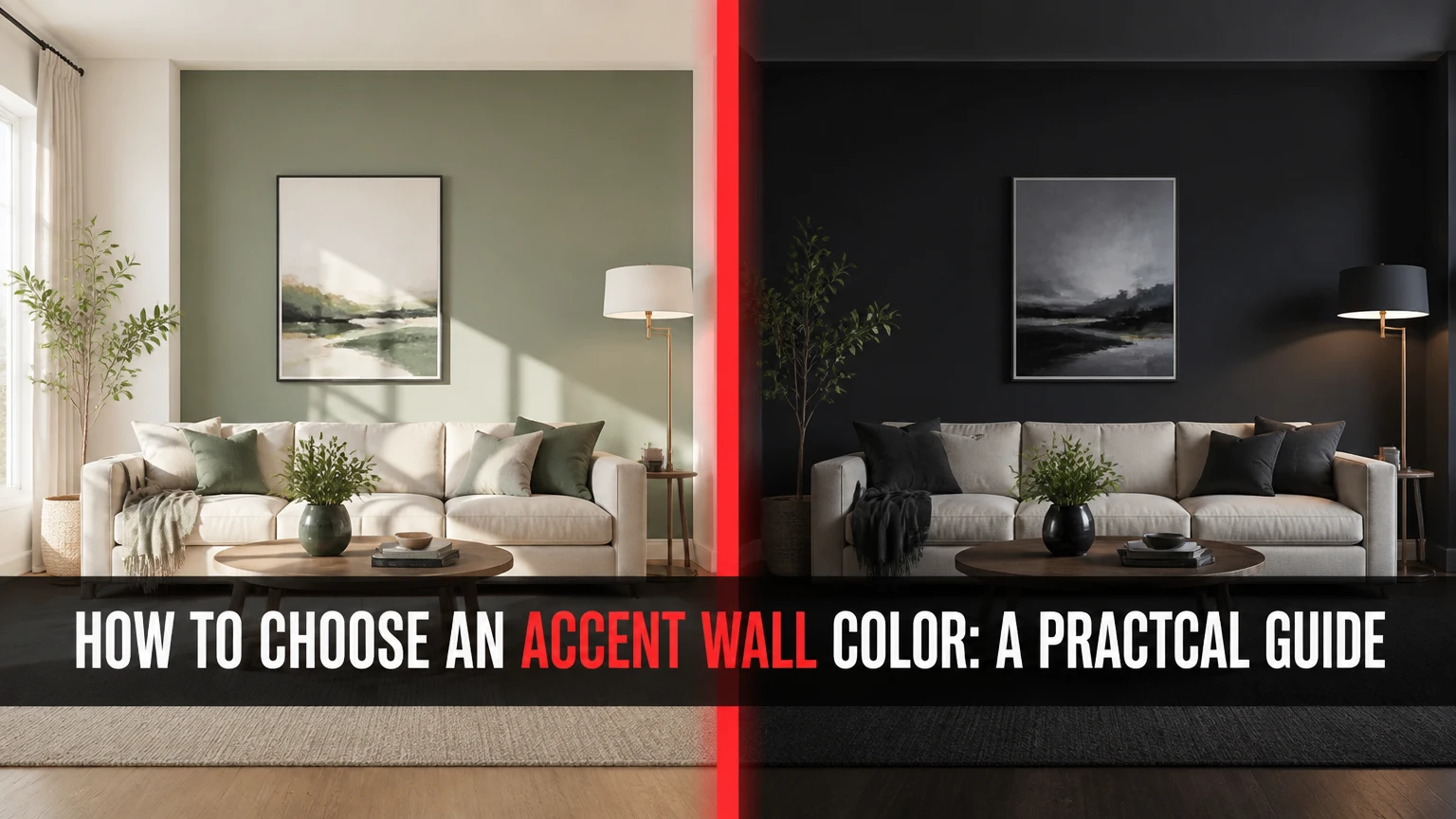
To choose an accent wall color, select the room’s strongest architectural or functional focal point, then match the color’s undertone, lightness, saturation, and finish to the room’s lighting and furnishings. Test large samples on the actual wall for at least one full day before buying paint, wallpaper, or paneling.
Key Facts at a Glance
The best accent wall is usually the wall behind a bed, fireplace, television, sofa, or major artwork.
North-facing light often makes colors appear cooler; warm undertones can balance that effect.
A noticeable painted contrast commonly begins around 20 LRV points, but undertone compatibility matters more than a rigid number.
A 12-by-12-inch sample is useful, while a 24-by-24-inch or larger sample gives a more reliable color impression.
Matte and eggshell finishes hide more surface unevenness; satin and semi-gloss reveal more wall defects.
A typical DIY painted accent wall costs $30-$100 and takes one weekend, excluding major repairs.
What Is an Accent Wall?
An accent wall is one wall finished differently from the other room walls with paint, wallpaper, tile, wood, plaster, or another surface treatment. The difference creates visual hierarchy, directs attention, defines a zone, or changes the perceived mood and proportions of the room.
An accent wall is most effective when the wall already has a reason to receive attention. A fireplace wall, headboard wall, built-in shelving wall, or wall facing the room entrance has a natural visual advantage. A random wall can still work, but its color must provide enough structure to justify the interruption.
Color is not the only variable. Wall size, ceiling height, furniture placement, window exposure, flooring, trim, and sightlines determine whether the accent reads as intentional. Wassily Kandinsky wrote, “Color is a power which directly influences the soul.” In practical terms, color changes both emotional response and visual weight.
What does an accent wall do?
An accent wall performs four main design functions:
- Creates a focal point: A dark wall behind a bed can organize a bedroom around the sleeping area.
- Defines a zone: A saturated wall can distinguish a dining area from a living area in an open floor plan.
- Changes perceived proportions: A darker short wall can visually balance a long, narrow room.
- Sets a mood: Deep blue, green, brown, or charcoal can make a large room feel quieter and more enclosed.
An accent wall is not automatically a solution for an unattractive room. It cannot correct poor furniture scale, inadequate lighting, damaged drywall, or an awkward circulation path.
Before You Start
Prepare the wall, color samples, lighting observations, and surrounding finishes before choosing a final color. Most selection errors happen because people compare tiny paper chips under store lighting instead of testing the complete color system inside the room.
| Project factor | Typical paint project | Typical wallpaper project | Typical panel project |
|---|---|---|---|
| DIY material cost | $30-$100 | $50-$200 | $150-$500 |
| Professional cost | $200-$600 | $300-$900 | $600-$1,800 |
| Preparation time | 2-5 hours | 3-8 hours | 4-12 hours |
| Installation time | 4-8 hours | 5-10 hours | 1-3 days |
| Reversibility | High | Medium to high | Low |
| Recommended skill | Beginner | Intermediate | Intermediate to advanced |
Materials for a typical 12-by-14-foot room: two to three sample pots, one quart of primer if the existing wall is damaged or strongly colored, one gallon of finish paint for approximately 350-400 square feet of coverage, a roller with the correct nap, a 2-inch angled brush, painter’s tape, drop cloths, filler, sanding paper, and a flashlight.
Measure the wall first. A 10-by-8-foot wall contains 80 square feet before subtracting doors and windows. One gallon usually covers two coats on that area, but porous surfaces, deep colors, and textured walls can require more.
How to Choose an Accent Wall Color
Choose the color by moving through five decisions: identify the focal wall, study the light, select the material, coordinate the palette, and test the finish in place. The focal wall and undertone usually determine success more strongly than the current paint trend.
Step 1: Choose the wall with the strongest focal point
Select the wall that already attracts attention through architecture, furniture, or the room’s main sightline. In a bedroom, that is commonly the wall behind the headboard; in a living room, it may be the fireplace or media wall.
Avoid a wall broken into small sections by several doors, irregular windows, switches, and large openings. Multiple interruptions make a single color look accidental. A wall with one centered window can work if the color frames the opening, while a wall with three mismatched windows often lacks visual unity.
Which wall should you choose?
| Room feature | Preferred accent wall | Reason | Common exception |
|---|---|---|---|
| Bedroom | Behind the headboard | Anchors the bed | Bed placed away from the wall |
| Living room | Fireplace or sofa wall | Organizes seating | Fireplace already has strong stone |
| Dining room | Wall behind the table | Defines dining activity | Table sits in the room center |
| Home office | Desk or video-call background | Establishes work zone | Backdrop appears on camera |
| Open-plan room | Zone boundary wall | Separates functions | No continuous wall exists |
A useful practitioner rule is to stand at the room entrance and identify the first substantial wall visible without turning your head. If that wall also supports the room’s main furniture, it is a strong candidate. If the wall is mostly a passageway, choose the furniture wall instead.
Step 2: Assess natural and artificial light
Evaluate the paint color in morning, afternoon, evening, and artificial light because the same pigment can change substantially across color temperature and exposure. Window direction provides a starting point, but nearby buildings, trees, curtains, and neighboring walls can alter the result.
| Window exposure | Typical light character | Colors that often work | Colors requiring testing |
|---|---|---|---|
| North-facing | Cooler, softer, gray-blue | Cream, terracotta, warm beige, muted olive | Blue-gray, lavender, icy white |
| South-facing | Brighter, warmer | Cool blue, sage, charcoal, balanced white | Very warm yellow, intense orange |
| East-facing | Warm morning, cooler afternoon | Soft green, balanced beige, dusty blue | Strong red or yellow |
| West-facing | Cooler morning, warm evening | Blue-green, taupe, muted navy | Highly saturated warm colors |
Warm and cool labels describe undertones, not room temperature. A gray with blue-violet content can make a beige room look dirty, while a green-gray with yellow content may connect better to oak flooring and cream upholstery.
Artificial light changes the late-day reading. Bulbs around 2700K usually emphasize warm red and yellow content, while bulbs around 4000K can make blue and green appear cleaner and more pronounced. Test the sample with the actual lamps, sconces, and overhead fixtures installed.
Step 3: Decide between paint, wallpaper, and texture
Choose paint when flexibility, low cost, and simple maintenance matter most. Choose wallpaper when pattern or narrative matters more than rapid future changes, and choose paneling or texture when the wall needs physical depth or architectural definition.
| Finish type | Typical cost per accent wall | Installation | Best use | Main limitation |
|---|---|---|---|---|
| Interior paint | $30-$100 DIY | 1-2 days | Flexible color change | Shows dents and repairs |
| Peel-and-stick wallpaper | $50-$200 DIY | 1 day | Rental-friendly pattern | Seams may lift on dusty walls |
| Traditional wallpaper | $100-$400 DIY | 1-2 days | Durable pattern | Removal requires more labor |
| Board and batten | $150-$500 DIY | 2-3 days | Traditional geometry | Adds permanent holes and trim |
| Wood slats | $250-$800 DIY | 2-4 days | Warmth and depth | Dust collects between slats |
| Brick or stone veneer | $300-$1,200 DIY | 2-4 days | Rustic or industrial feature | Heavy, costly, and difficult to reverse |
Wallpaper does not reliably hide major wall defects. Glossy or thin paper can make uneven seams more visible, and peel-and-stick products need a clean, smooth, fully cured surface. Wood paneling covers some imperfections but cannot correct moisture damage or an unstable substrate.
Step 4: Match the color to the existing palette
Build the accent color from something already in the room, such as a rug, artwork, upholstery, tile, wood tone, or window treatment. Pulling a color from an existing object usually creates stronger cohesion than choosing an isolated favorite color.
Use one of these palette relationships:
| Palette method | Relationship | Example with warm beige walls | Visual effect |
|---|---|---|---|
| Monochromatic | Same hue, different value | Beige walls with medium taupe | Quiet and spacious |
| Analogous | Neighboring hues | Beige walls with muted olive | Natural and connected |
| Complementary | Opposite color families | Beige walls with blue-gray | Stronger contrast |
| Split complementary | Base plus two adjacent opposites | Beige with blue-green and muted plum | Layered contrast |
| Tonal neutral | Similar saturation and warmth | Cream with warm mushroom | Refined and low contrast |
The 60-30-10 rule can help organize a room, but it is not a mandatory formula. The dominant field may occupy about 60 percent, furniture and secondary surfaces about 30 percent, and smaller accents about 10 percent; an accent wall itself can exceed 10 percent because it is a surface rather than a small accessory.
Should the accent wall be darker or lighter?
A darker accent wall is usually the safer choice when the goal is to anchor furniture or create intimacy. A lighter or brighter wall works when the room is already dark, the architecture needs expansion, or the accent wall carries a mural or textured surface.
Dark colors do not always make a room feel smaller. A dark color can make a distant wall recede, especially in a long narrow room, while a dark wall beside the entrance can feel heavy. The direction of the visual effect depends on the wall’s position and the room’s sightline.
Use a same-color paint strip when you want subtle contrast. A difference of roughly 10-20 LRV points can produce a restrained shift, while 20-30 points often creates a clearly visible painted contrast. LRV, or Light Reflectance Value, ranges from near-black at low values to near-white at high values, but undertone and sheen can make equal numerical differences appear unequal.
Step 5: Test the color in place
Paint large removable sample boards or large wall sections, then inspect them for at least 24 hours. Place samples on the proposed accent wall and on an adjacent wall because surrounding colors change perceived saturation and temperature.
Use two coats over a surface similar to the final wall. A single coat can look lighter, patchier, or more transparent than the finished result. Keep samples at least 24 inches wide when possible, and do not place them directly beside one another because adjacent colors distort comparison.
Check each sample at these times:
- Morning daylight
- Midday daylight
- Late afternoon
- Evening lamps
- Lights on and lights off
- Beside trim, flooring, upholstery, and artwork
You will know the test worked when the color remains compatible with the room’s fixed finishes across the entire day, not merely when it looks attractive beside a white sample card.
Common mistake: judging a dark color from a six-inch paper chip. Small chips suppress visual weight and do not show how the color behaves across a broad wall.
Which Accent Color Strategy Fits Your Room?
The best color strategy depends on the room’s existing contrast, light level, and desired visual weight. Bold saturated colors create the strongest focal point, while monochromatic and muted colors provide greater tolerance for furniture changes.
| Strategy | Example accent colors | Suitable room condition | Contrast level | Future flexibility |
|---|---|---|---|---|
| Deep neutral | Charcoal, espresso, deep taupe | Light room with simple furniture | High | Medium |
| Jewel tone | Emerald, navy, aubergine | Bright room with restrained decor | High | Low |
| Earth tone | Terracotta, clay, olive | Wood, leather, linen, natural fiber | Medium | Medium |
| Soft tonal | Mushroom, dusty blue, sage | Small or low-contrast room | Low to medium | High |
| Graphic pattern | Botanical, geometric, mural | Plain furniture and quiet walls | Medium to high | Low |
A saturated color needs visual support. Repeat it in two smaller objects, such as a cushion and artwork, rather than scattering many unrelated colors throughout the room. A muted accent can stand alone because its lower saturation does not compete as aggressively.
How should room size affect the color?
Small rooms can use dark accent colors successfully when the accent wall is short, well lit, or behind a bed or console. A dark color becomes risky when it covers the longest wall, receives little light, and sits beside dark flooring and heavy furniture.
For a narrow room, try the darker color on the short end wall to reduce the tunnel effect. For a low-ceiling room, keep the ceiling and upper trim light unless you deliberately want a cocoon-like effect. For a tall room, extending the accent color onto the ceiling by 6-12 inches can visually lower the upper boundary.
How Do You Choose by Room?
Choose the accent color according to the room’s activity and fixed materials. Bedrooms tolerate deeper, quieter hues; living rooms need to coordinate with upholstery and sightlines; kitchens and bathrooms require greater attention to moisture, tile, and cleaning.
| Room | Reliable starting colors | Finish | Avoid when |
|---|---|---|---|
| Bedroom | Dusty blue, olive, muted navy | Matte or eggshell | Color feels stimulating at night |
| Living room | Warm taupe, charcoal, clay, deep green | Eggshell | Wall conflicts with patterned sofa |
| Dining room | Terracotta, wine red, deep teal | Eggshell or satin | Room already has intense artwork |
| Kitchen | Deep green, blue-gray, warm white | Satin | Grease and steam reach the wall |
| Bathroom | Blue-green, soft gray, mineral beige | Satin or bathroom-rated paint | Ventilation is poor |
| Office | Ink blue, forest green, muted plum | Matte or eggshell | Video background becomes distracting |
In a bedroom, place the strongest color behind the bed rather than opposite it if the room should feel restful. In a home office, sample the wall from the camera’s viewpoint because a color that works from the doorway may appear too dark or saturated on video.
What Mistakes Make Accent Walls Look Wrong?
The most common accent-wall failures involve poor wall selection, incompatible undertones, insufficient preparation, and excessive competing detail. Correcting the color alone will not solve a wall that lacks a clear focal relationship.
| Failure | Visible symptom | Likely cause | Corrective action |
|---|---|---|---|
| Wrong wall | Color feels random | No focal point or broken sightline | Move color to the furniture or feature wall |
| Undertone clash | Beige looks pink or gray looks blue | Warm and cool neutrals conflict | Compare samples beside flooring and trim |
| Patchy finish | Uneven blocks after drying | Porous repairs or one coat | Spot-prime, sand, and apply two full coats |
| Harsh ceiling edge | Dark wall appears unfinished | Bright ceiling creates abrupt contrast | Test a related ceiling white or extend color |
| Overloaded room | Eye has nowhere to rest | Patterned rug, curtains, and wall compete | Reduce one competing pattern |
| Wall looks flat | Color has no depth | Low light or overly uniform surface | Add directional lighting or texture |
Do not use semi-gloss to repair a lifeless wall unless you accept more reflected glare and visible defects. Lighting usually provides a better correction than increased sheen. Matte paint can make a dark color appear deeper, while satin can make the same color look brighter and more reflective.
When should you skip an accent wall?
Skip a painted accent wall when the room already has several competing focal points, the proposed wall is mostly openings, or the surrounding finishes cannot support another color. A full-room color, ceiling treatment, artwork arrangement, or furniture placement may produce a more coherent result.
An accent wall is also a poor choice for severe dampness, loose wallpaper, crumbling plaster, or active settlement cracks. Repair the substrate first. Decorative color cannot substitute for a sound wall.
How Can You Fix a Bad Accent Wall?
Fix a disappointing accent wall by diagnosing whether the problem is color, undertone, placement, sheen, lighting, or preparation. Repaint only after identifying the cause, because a lighter or darker replacement will not correct a wall chosen for the wrong sightline.
If the color is too bright, first view it beside the room’s fixed finishes. If the hue is compatible but too intense, repaint with a lower-saturation version rather than relying on a clear topcoat, which rarely changes pigment intensity predictably.
If the wall feels too dark, improve lighting or use a color with a higher LRV before abandoning the concept. If paint bleeds under tape, allow the base coat to dry, seal the tape edge with the base-wall color, then apply the accent color in two thin coats.
If the wall looks blotchy, sand rough areas with 180-220 grit paper, remove dust, spot-prime repairs, and repaint the entire wall rather than touching up isolated patches.
When Do Accent Walls Cost and Take the Most?
A typical painted accent wall costs $30-$100 as a DIY project and $200-$600 when professionally completed, while paneling, wallpaper, wall repairs, and unusual height increase the range. Most straightforward painted walls take four to eight active hours spread across one or two days.
| Wall condition | DIY cost range | Professional cost range | Typical duration |
|---|---|---|---|
| Smooth wall, light color | $30-$70 | $200-$400 | 1 day |
| Dark color over light paint | $40-$100 | $250-$600 | 1-2 days |
| Minor nail holes and scuffs | $50-$130 | $300-$700 | 1-2 days |
| Textured or porous wall | $70-$180 | $400-$900 | 2-3 days |
| Peel-and-stick wallpaper | $50-$200 | $300-$900 | 1-2 days |
| Board and batten | $150-$500 | $600-$1,800 | 2-4 days |
These are typical planning ranges for a single residential wall in the United States, not fixed quotes. Regional labor rates, wall height, access, furniture moving, primer, repairs, and paint brand can change the final price.
Which Accent-Wall Material Should You Use?
Paint is the best default for most homeowners because it offers the lowest cost, the broadest color range, and the simplest future change. Wallpaper or paneling becomes preferable when pattern, acoustic texture, or architectural detail matters more than reversibility.
| Decision criterion | Paint | Wallpaper | Wood paneling | Textured plaster |
|---|---|---|---|---|
| Typical lifespan | 5-10 years | 7-15 years | 10-25 years | 10-20 years |
| Color flexibility | Very high | Medium | Low | Medium |
| Surface depth | Low | Medium | High | High |
| Repair difficulty | Low | Medium to high | Medium | High |
| Moisture tolerance | Product dependent | Product dependent | Product dependent | Product dependent |
| Rental suitability | High with repainting | High with approved removable paper | Low | None |
Paint is not good at disguising major wall damage. Paneling is not good for renters or rooms where furniture must sit flush against the wall. Wallpaper is not good for damp, dusty, or heavily textured surfaces unless the manufacturer specifically approves that application.
Which Color Should You Choose for Your Situation?
Choose a muted tonal color for the safest result, a darker color for architectural anchoring, and a saturated or patterned treatment only when the rest of the room provides visual restraint. The right choice depends on the room’s fixed finishes more than on a universal list of fashionable colors.
For a rental
Use high-quality removable wallpaper, large framed fabric panels, or a tension-mounted textile installation. Confirm the landlord’s rules and test adhesive on an inconspicuous area, because removable products can still lift paint from poorly bonded walls.
For resale
Choose a restrained warm neutral, muted green, soft charcoal, or monochromatic panel treatment. A highly personal mural can appeal strongly to one buyer and narrow the room’s perceived flexibility, while subtle architectural detail generally integrates more easily with varied furniture.
For a design-led room
Use a deep jewel tone, mural wallpaper, or slatted wood only when the wall has a clear focal role and the lighting can support its texture. Repeat the accent color in limited accessories, then leave enough quiet surface around the feature for the eye to rest.
For a low-light room
Prefer warm off-white, clay, muted olive, camel, or warm mushroom over a blue-based gray. Sample every choice at night because low daylight can make gray, green, and blue appear substantially darker than expected.
The Bottom Line
To choose an accent wall color, start with the strongest focal wall, identify the room’s light direction, match the color’s undertone to existing finishes, and decide whether paint, wallpaper, or texture fits the project. Test two coats on large samples for 24 hours, compare morning and evening light, and select the color that supports the room’s furniture and proportions rather than competing with them.
Frequently Asked Questions
Can an accent wall be lighter than the other walls?
Yes, a lighter accent wall works when the goal is to brighten a dark room, emphasize a window, or create a soft monochromatic shift. Choose a lighter value with the same undertone as the surrounding walls, because a warm cream beside a blue-gray can look disconnected even when both colors are light.
Should the accent wall match the furniture?
The accent wall should coordinate with the furniture rather than match it exactly. Pull a secondary color from upholstery, artwork, a rug, or woodwork, then adjust its saturation or lightness so the wall provides structure without turning the room into a single-color set.
How many accent walls can one room have?
Most rooms need one accent wall because a single feature creates clear hierarchy. Two accent walls can work in a large open-plan space when they define separate zones and share a color family, but several unrelated accent walls usually weaken the focal point.
Are accent walls outdated?
Accent walls are not inherently outdated, but arbitrary single-wall color has become less effective than purposeful color zoning, full-room color, wallpaper, or architectural treatments. An accent remains current when it responds to a fireplace, bed, seating group, circulation path, or other clear feature.
Can I paint an accent wall without painting the other walls?
Yes, you can repaint only the accent wall if the existing walls are clean, sound, and compatible with the new undertone. Clean the surface, repair defects, prime stained or glossy areas, and test the new color beside the existing paint before committing to the full wall.
What sheen is best for an accent wall?
Matte or eggshell is usually best for bedrooms and living rooms because those finishes reduce glare and conceal minor defects. Satin is more practical in kitchens, bathrooms, and high-contact areas, but its reflected light can make uneven drywall and patching more visible.