
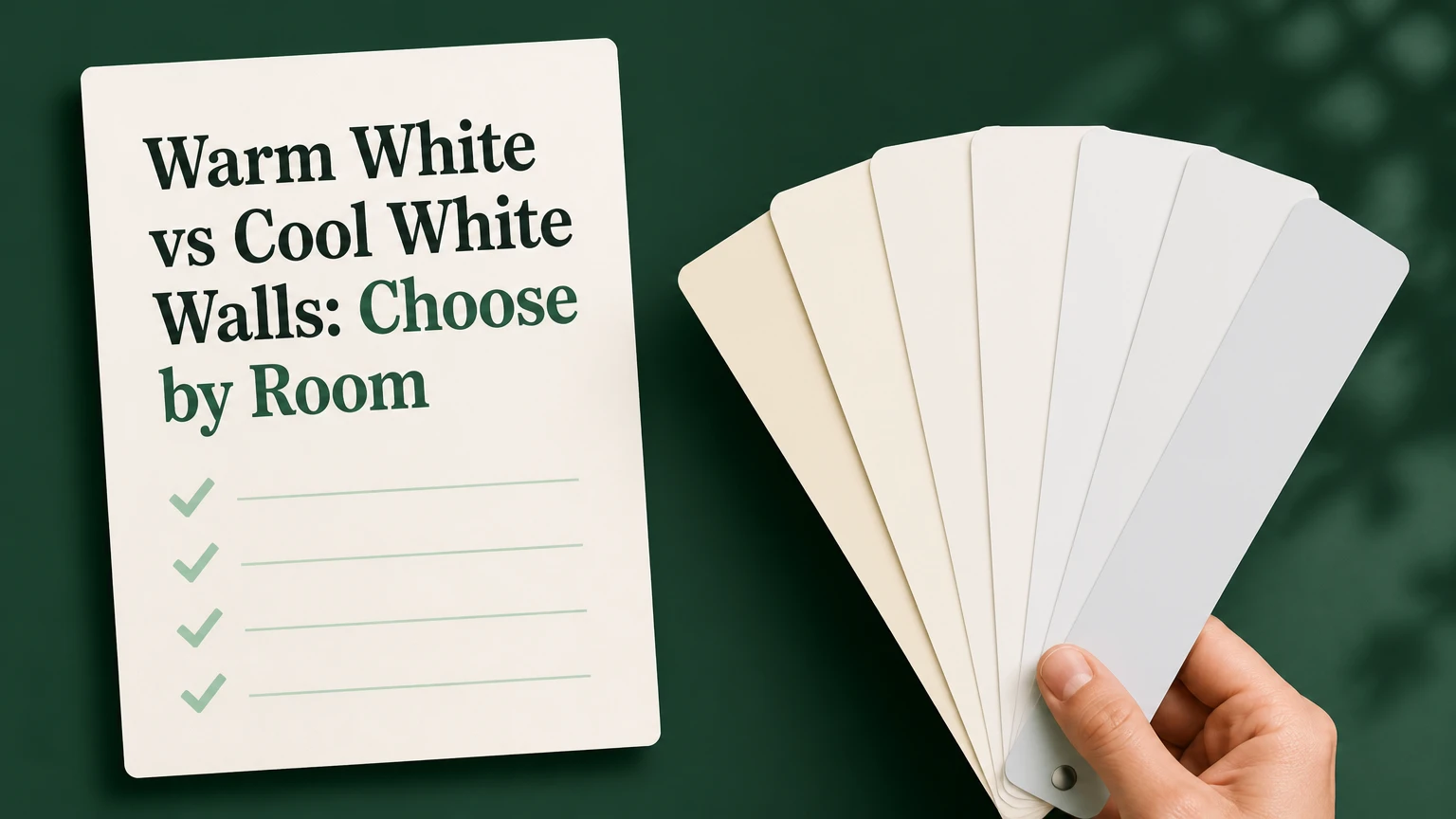
Warm white walls are the better overall choice for rooms with limited daylight, oak flooring, brass, beige textiles, or traditional furniture. Cool white walls win in bright contemporary rooms containing gray stone, black accents, chrome, or blue-based fabrics. The deciding factors are fixed finishes, window light, bulb temperature, and LRV, not personal preference alone.
Quick Verdict
Dark north-facing room: Warm white.
Bright modern room: Cool white.
Oak floors and brass hardware: Warm white.
Gray marble, chrome, and black accents: Cool white.
Rental, resale, or uncertain furniture: Balanced warm-neutral white.
Small room: Choose the higher-LRV sample that avoids glare.
| Criterion | Warm white walls | Cool white walls |
|---|---|---|
| Common undertones | Yellow, cream, beige, pink, or peach | Blue, gray, green, or blue-gray |
| Typical LRV range | 70-89.5, depending on formula | 75-90.04, depending on formula |
| Best daylight condition | North-facing, shaded, or weak daylight | Strong south- or west-facing daylight |
| Best furnishings | Oak, walnut, leather, linen, brass, gold | Gray stone, ash, black, chrome, stainless steel |
| Visual effect | Softer, closer, more intimate | Crisper, cleaner, more expansive |
| Common risk | Yellow or muddy appearance | Gray, blue, or sterile appearance |
| Typical bulb pairing | 2,700K-3,000K, or balanced 3,000K | 3,000K-4,000K; avoid excessive blue light |
| Best style match | Traditional, rustic, transitional, bohemian | Contemporary, industrial, minimalist |
| Repainting risk | High if existing finishes are blue-gray | High if existing finishes are orange or red |
Warm White vs Cool White Walls: The Core Difference
Warm white contains small amounts of pigments that push the color toward yellow, cream, beige, pink, or peach. Cool white uses undertones that push perception toward blue, gray, green, or blue-gray. The difference is subtle on a paint card but much stronger beside flooring, trim, sunlight, and furniture.
Paint does not have a Kelvin temperature. Kelvin measures the color temperature of the light source, such as a 2,700K LED or 4,000K fluorescent lamp. Paint reflects that light, so a warm wall under a warm bulb can look considerably creamier than it does beside a north-facing window.
| Light source | Typical Kelvin range | Effect on warm white | Effect on cool white |
|---|---|---|---|
| Candle or incandescent-style LED | 2,200K-2,700K | Intensifies yellow and cream | Can soften blue but still appear gray |
| Warm residential LED | 2,700K-3,000K | Creates a cozy, golden cast | Reduces crispness |
| Neutral LED | 3,000K-3,500K | Keeps warmth controlled | Preserves clean appearance |
| Cool LED or daylight lamp | 4,000K-5,000K | Can look beige or slightly dull | Accentuates blue and gray |
The practical distinction is simple: warm white adds visual warmth, while cool white emphasizes clarity and contrast. Neither category is automatically brighter, cleaner, or more spacious because undertone and LRV vary by product.
Winner for balanced comfort: Warm white walls, provided the room already contains warm finishes and the bulbs are no warmer than 3,000K.
Natural Light and Room Orientation
North-facing windows usually deliver cooler, bluer daylight, especially in rooms obstructed by trees or neighboring buildings. A warm white can counter that cast and prevent gray walls from feeling cold. South-facing rooms receive stronger light for much of the day, so warm paint may become noticeably cream or yellow.
West-facing rooms create a particular problem because afternoon light is warm and intense. Cool white can restrain orange or golden glare, but an extremely blue-based white may look gray after sunset. East-facing rooms are warmer in the morning and cooler later, so a balanced white often performs better than an extreme choice.
Orientation is a starting point, not a rule. Window size, exterior shade, glazing, wall color outside the window, and nearby trees can change the result more than compass direction.
| Room condition | Preferred starting point | Reason | Main warning |
|---|---|---|---|
| Small north-facing study | Warm white, LRV 80-89 | Adds warmth to blue daylight | Avoid strong yellow undertones |
| Bright south-facing kitchen | Cool or neutral white, LRV 82-90 | Controls warm glare | Very cool paint may look clinical |
| West-facing living room | Balanced cool-neutral white | Limits afternoon orange | Test after 4:00 PM |
| East-facing bedroom | Soft warm-neutral white | Works with morning warmth and evening shade | Avoid overly pink paint |
| Windowless hallway | Warm-neutral, high-LRV white | Prevents a gray tunnel effect | Lighting quality matters more than orientation |
For a north-facing room, Sherwin-Williams Alabaster SW 7008 is a safer warm example than Farrow & Ball White Tie, whose deeper yellow character can become too creamy. For a bright contemporary room, Benjamin Moore Chantilly Lace OC-65 or Decorator’s White CC-20 offers a cleaner starting point.
Winner for cool daylight: Warm white walls. Winner for intense warm daylight: Cool or balanced-neutral white walls.
LRV, Brightness, and Perceived Space
Light Reflectance Value, or LRV, estimates how much visible light a surface reflects. The scale runs from 0% for black to 100% for theoretical pure white. Many interior whites fall broadly between 70 and 90, although the exact range varies by manufacturer and formula.
A high LRV can make a small room appear lighter, but it cannot create daylight. Gloss level, ceiling height, shadows, window area, and surrounding colors also control perceived brightness. A cool white with an LRV of 86 may appear darker than a warm white with an LRV of 82 if the cool paint turns gray in a shaded room.
| Named paint | Category | Approximate LRV | Practical reading |
|---|---|---|---|
| Benjamin Moore Simply White OC-117 | Warm-leaning | 89.5 | Bright, soft, lightly yellow |
| Sherwin-Williams Alabaster SW 7008 | Warm | 82 | Creamy, restrained, comfortable |
| Farrow & Ball White Tie No. 2002 | Warm | Manufacturer formula varies | Deeper traditional cream |
| Benjamin Moore Decorator’s White CC-20 | Cool-neutral | 82.7 | Crisp with gray-blue influence |
| Sherwin-Williams Extra White SW 7006 | Cool | 86 | Strong, clean, potentially stark |
| Benjamin Moore Chantilly Lace OC-65 | Neutral-cool | 90.04 | Very bright and minimally tinted |
| Sherwin-Williams Pure White SW 7005 | Balanced warm-neutral | Approximately 84 | Flexible resale and rental option |
Use higher LRV when a room is small, shaded, or dependent on reflected light. Use a lower LRV when an expansive room needs more visual weight, but do not select a low-LRV white solely to make a large room feel sophisticated. The undertone still has to match the room.
Winner for maximum reflected light: The higher-LRV sample, regardless of temperature. Winner for a softer appearance: Warm white at approximately LRV 80-85.
Flooring, Furniture, Trim, and Metal Finishes
Permanent finishes deserve more weight than the wall color trend. Replacing a wall is inexpensive compared with replacing red oak flooring, marble countertops, fitted cabinetry, or a large sectional sofa. Place the paint sample directly beside those materials before choosing.
Warm white typically connects with honey oak, walnut, terracotta, tan leather, natural linen, aged brass, and gold. Cool white typically connects with ash wood, gray oak, black furniture, polished concrete, stainless steel, chrome, and blue-gray textiles.
Trim creates an especially visible comparison. A cool white wall beside yellow cream trim can make the trim appear dirty. A warm white wall beside stark blue-white trim can make the wall appear yellow. Use the same color in different sheens when the existing architecture permits it.
| Fixed finish | Safer wall direction | Suitable example | Why |
|---|---|---|---|
| Red or honey oak | Warm | Simply White or Alabaster | Repeats the floor’s warmth |
| Walnut and cognac leather | Warm | Alabaster | Prevents cold contrast |
| Gray marble or quartz | Cool-neutral | Decorator’s White | Supports blue-gray veining |
| Black cabinetry | Cool or neutral | Chantilly Lace | Creates deliberate contrast |
| Cream tile | Warm | White Tie or Alabaster | Avoids a blue-white mismatch |
| Ash wood and brushed steel | Cool-neutral | Pure White or Decorator’s White | Preserves a clean palette |
| Mixed finishes | Balanced neutral | Pure White | Reduces undertone conflict |
Winner for warm materials: Warm white walls. Winner for cool materials: Cool white walls. Winner for mixed materials: A balanced warm-neutral such as Pure White.
Style and Atmosphere
Warm white creates a closer, quieter atmosphere because yellow, beige, and pink undertones soften contrast. It suits traditional, rustic, transitional, mid-century, and many bohemian interiors. It also makes textured materials such as linen, rattan, wool, and unfinished wood feel intentional rather than stark.
Cool white creates sharper contrast around black fixtures, simple cabinetry, linear furniture, and polished surfaces. It suits contemporary, industrial, minimalist, and gallery-like interiors. The same quality can become unpleasant in a dim room, where strong cool pigment may read as gray or institutional.
The best choice is not the style label alone. A modern home with walnut floors may need warm white, while a traditional home with gray limestone may need cool-neutral white.
Winner for cozy and historic interiors: Warm white walls. Winner for crisp modern interiors: Cool white walls.
Cost, Coverage, and Project Time
The color category does not materially change paint cost. The real cost difference comes from coverage, preparation, number of coats, wall height, surface condition, and whether the existing paint strongly contrasts with the new color.
For a typical 3.5-by-4.5-metre room, two gallons may be sufficient for two coats on average walls, but doors, ceilings, textured surfaces, and high-absorption drywall can increase consumption. Check the product’s stated coverage rather than assuming every gallon covers the same area.
| Project item | Typical DIY amount | Typical professional amount |
|---|---|---|
| Premium paint for average room | $120-$180 for two gallons | Included in project quote |
| Tape, rollers, tray, drop cloths | $30-$70 | Usually included |
| Peel-and-stick samples | $10-$40 | Often owner-paid |
| Total average room | $100-$200 | $400-$900 |
| Preparation and taping | 2-4 hours | 1-3 hours |
| First coat | 2-3 hours | 1-2 hours |
| Drying before second coat | 2-4 hours | 2-4 hours |
| Second coat | About 2 hours | 1-2 hours |
| Cleanup | About 2 hours | 1-2 hours |
| Full cure | 14-30 days | 14-30 days |
These are typical planning ranges, not quotations. Darker existing walls, glossy surfaces, nicotine staining, or a strong undertone mismatch may require primer or three coats. That adds both money and switching time.
A wrong white has a hidden cost: sample purchases, labor, furniture moving, and another repaint. Spending $20-$40 on large samples is cheaper than repainting a $600 professionally finished room.
Winner for direct cost: Neither. Warm and cool whites cost similar amounts, while preparation and repainting risk determine the budget.
Testing, Application, and Switching Risk
Never choose a white from a phone screen or a small printed card. Screens cannot reproduce undertones reliably, and small cards do not show how a color behaves beside flooring or trim. Use large peel-and-stick samples or painted boards, then move them around the room.
Test at least two walls, including the wall opposite the main window. Check the samples around 8:00 AM, 12:00 PM, and 8:00 PM. Turn on the actual lamps used in the room, because 2,700K bulbs can make a warm white appear much yellower.
| Test step | Time or condition | What to inspect |
|---|---|---|
| Place sample beside floor | Before painting | Yellow, pink, blue, or gray conflict |
| Test window wall | Morning and midday | Daylight cast and glare |
| Test opposite wall | Afternoon | Shadow behavior and apparent darkness |
| Turn on household lamps | Evening | Bulb temperature and yellowing |
| Compare with trim | All times | Dirty or blue-white contrast |
| Leave sample in place | Minimum 24 hours | Consistency across changing light |
| Decide after furniture returns | Final check | Interaction with textiles and wood |
Use flat or eggshell paint on walls and semi-gloss on trim, but keep their color temperature aligned. If the room contains 2,700K lamps and warm white looks too yellow, moving to 3,000K or 3,500K LEDs may solve the problem without repainting.
Winner for selection safety: A tested warm-neutral white. Extreme warm and extreme cool whites carry the greatest repainting risk.
Named Paint Examples and Alternatives
Benjamin Moore Simply White OC-117 is a bright warm-leaning option with an advertised LRV of 89.5. It works when a room needs light but contains warm wood or beige furnishings. In very warm artificial light, its yellow influence may become more obvious.
Sherwin-Williams Alabaster SW 7008 has an advertised LRV near 82 and reads creamier than Simply White. It is better for a cozy living room than for a stark, gallery-style interior. Farrow & Ball White Tie No. 2002 offers a deeper traditional cream and demands careful sampling beside modern white trim.
Benjamin Moore Decorator’s White CC-20 is a cool-neutral choice with an advertised LRV around 82.7. Sherwin-Williams Extra White SW 7006 is brighter and more blue-influenced, so it can feel severe under cool LEDs. Benjamin Moore Chantilly Lace OC-65 has an advertised LRV near 90.04 and provides a very bright, nearly neutral backdrop.
Sherwin-Williams Pure White SW 7005 is the most practical compromise for resale, rentals, and mixed furnishings. A pale greige such as Benjamin Moore Pale Oak OC-20 is a better alternative when both stark white and creamy white look wrong.
Paint manufacturers can revise formulas, sheen, and published data. Confirm current technical information on the manufacturer’s product page and test the actual can.
Winner for broad compatibility: Sherwin-Williams Pure White. Winner for maximum brightness: Benjamin Moore Chantilly Lace. Winner for traditional warmth: Sherwin-Williams Alabaster.
Which Should You Choose?
Choose warm white for dark or north-facing rooms
Choose Sherwin-Williams Alabaster or Benjamin Moore Simply White when the room receives cool daylight, has warm floors, or needs a softer atmosphere. Warm white counteracts blue shadows and supports wood, leather, linen, brass, and cream upholstery.
Avoid strongly yellow White Tie if the room already uses 2,700K lamps and golden oak. The combined effect can become heavy.
Choose cool white for bright modern rooms
Choose Benjamin Moore Decorator’s White, Chantilly Lace, or Sherwin-Williams Extra White when the room has strong south- or west-facing daylight and includes gray stone, black cabinetry, chrome, or blue-gray fabrics.
Use Extra White only after testing it at night. Its crispness can become stark under cool LEDs or in rooms with limited daylight.
Choose warm-neutral white for resale or rentals
Choose Sherwin-Williams Pure White when furniture is unknown, occupants may change, or the room needs broad appeal. Pure White avoids the strong yellow cast of traditional creams while remaining less clinical than a blue-based white.
A slightly warm-neutral white also reduces the chance that future furniture will expose an undertone mismatch.
Choose a neutral alternative for mixed finishes
Choose a balanced white or pale greige when the room combines oak, gray tile, black hardware, and cream textiles. Forcing a strongly warm or cool wall into a mixed palette usually creates one visible conflict.
Sample Pure White, a neutral-cool white, and a pale greige together. Select the sample that creates the fewest color shifts across the day.
Choose cool white for a clean commercial aesthetic
Choose cool white when the intended result resembles a gallery, studio, contemporary office, or industrial loft. Pair it with 3,500K-4,000K lighting, but avoid very blue 5,000K lamps in living areas because they can make skin tones and textiles look harsh.
Limitations and Overlooked Trade-Offs
Warm white disappoints when a room already contains yellow lighting, orange wood, cream tile, and gold metal. Instead of looking welcoming, the space can appear dated or monochromatic. A neutral 3,000K bulb and a less yellow warm-neutral paint usually correct the problem.
Cool white disappoints in dark north-facing rooms, especially when the walls, ceiling, and floor all reflect blue-gray light. The result may look gloomy rather than spacious. A higher LRV does not eliminate that problem because reflectance cannot replace daylight.
The north-versus-south rule also fails when exterior surroundings dominate. A north-facing room overlooking a bright courtyard may need cool-neutral paint. A south-facing room shaded by trees may need warm white.
Nobody can select the right white from LRV alone. LRV describes reflectance, not undertone, glare, contrast, or emotional appearance. Nobody can select it from the fixture list alone either, because daylight changes the wall for much of the day.
The most expensive mistake is choosing wall paint before accounting for permanent finishes. Flooring, countertops, cabinetry, and trim should establish the undertone direction first.
Frequently Asked Questions
Do warm white walls make a room look smaller?
Warm white can make a room feel visually closer because cream and beige undertones reduce contrast. That does not necessarily reduce measured brightness. A high-LRV warm white such as Simply White can reflect substantial light while retaining a softer appearance. Use sample boards to distinguish warmth from actual darkness.
Can warm white and cool white trim be used together?
They can be used intentionally, but the contrast must be controlled. Cool white walls beside yellow cream trim often make the trim look dirty, while warm walls beside blue-white trim can look yellow. Matching the wall and trim color, then changing the sheen, is the safest approach.
Are cool white walls better for small rooms?
Cool white is not automatically better for small rooms. A high-LRV cool white can increase reflected light in a bright small room, but a blue-gray undertone can make a shaded small room feel colder. Choose the highest-LRV sample that remains compatible with the floor and daylight.
What bulb temperature works with warm white paint?
Use 2,700K-3,000K bulbs for a deliberately cozy result. If warm white looks too yellow, use 3,000K-3,500K LEDs rather than immediately repainting. The bulb’s color rendering index also matters for furniture and textiles, so select a residential LED with a CRI of 90 or higher when available.
Is Chantilly Lace warm or cool?
Benjamin Moore Chantilly Lace OC-65 is generally described as neutral to slightly cool. Its advertised LRV is approximately 90.04, and it has relatively little visible undertone compared with creamier whites. In warm evening light it can soften, while beside warm wood it may still read cleaner than the furnishings.
Is Alabaster too yellow for modern interiors?
Sherwin-Williams Alabaster is warm but usually more restrained than a strong traditional cream. It can work in modern interiors containing oak, natural stone, linen, or brass. It may look too yellow beside blue-gray marble, stark black-and-white finishes, or 4,000K lighting, so test it beside the largest fixed surface first.