
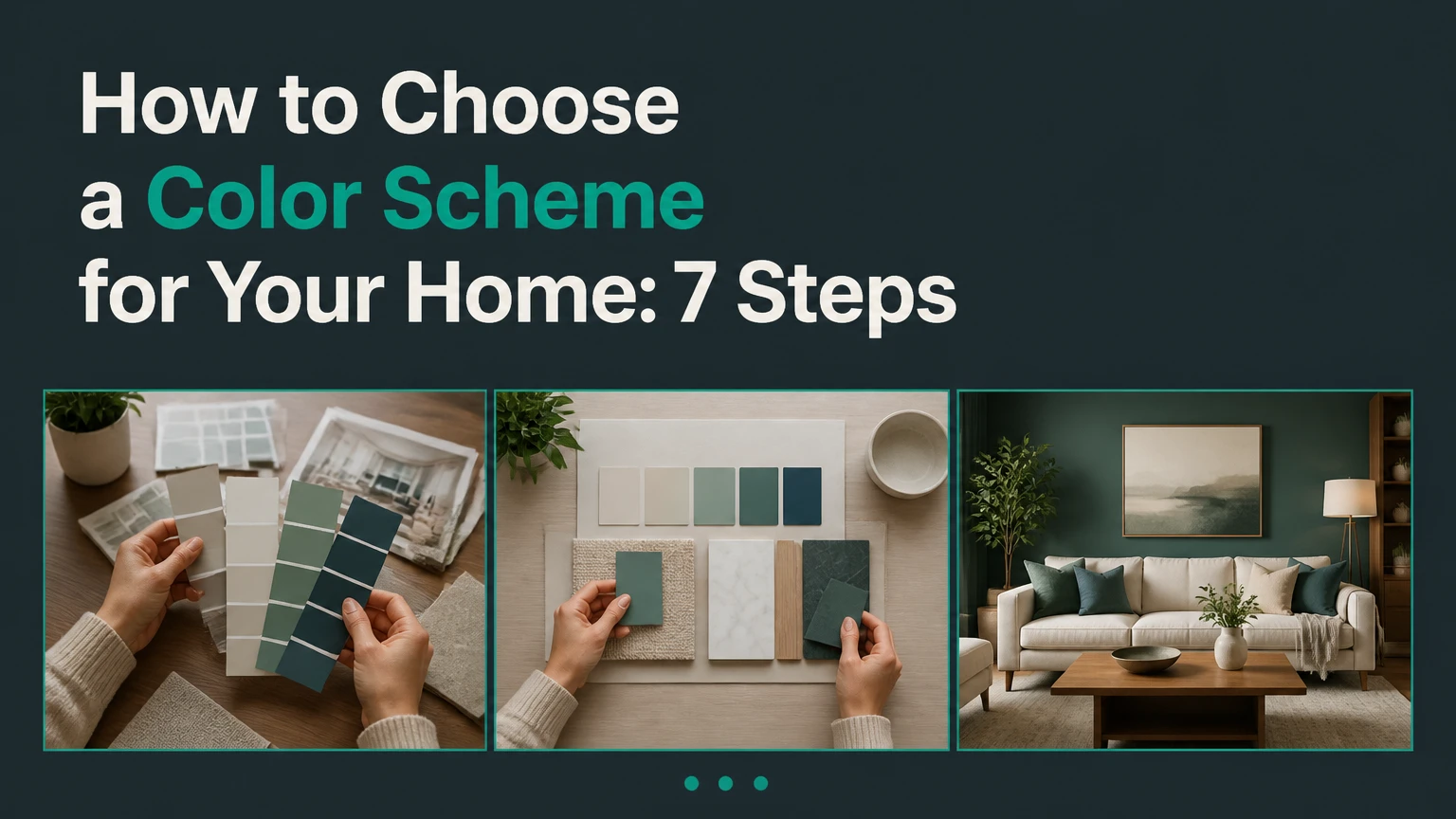
To choose a color scheme for your home, start with fixed finishes, identify the room’s desired mood, study its natural and artificial light, then build a dominant, secondary, and accent palette. Test large samples across a full day before purchasing paint, because undertones and lighting determine whether colors actually coordinate.
Key facts at a glance
A residential palette usually contains one dominant color, one or two supporting colors, and one controlled accent.
The 60-30-10 rule assigns approximate visual weight, not mandatory paint coverage.
Light Reflectance Value, or LRV, runs from 0 for black to 100 for pure white.
North-facing rooms usually need warmer color bias, while south-facing rooms can tolerate cooler bias.
Large sample boards reveal undertones more reliably than small paper chips.
Paint sheen should follow surface exposure: flat ceilings, washable walls, and harder-wearing trim.
What Is a Home Color Scheme?
A home color scheme is a repeatable relationship among wall color, ceiling color, trim, flooring, cabinetry, furniture, textiles, metals, and decorative accents. The goal is not to use identical colors everywhere; the goal is to make adjacent rooms feel related when viewed through doorways, hallways, and open sightlines.
A useful palette has three layers. The dominant color occupies the greatest visual area, often walls, large rugs, or cabinetry. The secondary color supports the dominant color through upholstery, curtains, tile, wood tones, or a smaller painted surface. The accent color appears in limited quantities through art, cushions, lamps, hardware, or one architectural feature.
Color relationships also depend on value, saturation, temperature, and texture. Two blue paints may coordinate poorly if one is dusty and gray while the other is intensely saturated. A warm white wall can work with green cabinetry when their value and undertones are compatible, even though their hue families differ.
How many colors should a home have?
A practical whole-home palette often uses four to seven related colors, including neutrals and finishes, rather than a new unrelated color in every room. Closed rooms can vary more freely, while open-plan spaces need stronger repetition through flooring, trim, textiles, or recurring accent colors.
The 60-30-10 rule is a starting framework, not a mathematical requirement. A room with patterned wallpaper may reverse the apparent proportions, and a minimalist room may use 80-15-5. Consistent relationships matter more than exact percentages.
How Does Lighting Change Color?
Lighting changes perceived color because daylight direction, bulb temperature, intensity, and surrounding surfaces alter the light reaching the eye. The same paint can appear cooler in shadow, warmer beside golden wood, and lighter under a high-output lamp.
The U.S. Department of Energy uses correlated color temperature to describe light appearance: lower Kelvin values look warmer and higher values look cooler. A typical 2700K lamp adds yellow warmth, while a 4000K lamp appears whiter or bluer. These ratings describe the lamp, not the paint.
| Room condition | Typical visual effect | Useful color response | Sampling priority |
|---|---|---|---|
| North-facing room | Blue-gray daylight, limited direct sun | Cream, beige, muted peach, warm taupe | Test during afternoon shadow |
| South-facing room | Stronger, warmer daylight | Blue-gray, sage, balanced white, cool beige | Test at midday |
| East-facing room | Warm morning, cooler afternoon | Balanced neutrals, soft green, muted blue | Test morning and late afternoon |
| West-facing room | Dimmer morning, orange evening light | Soft gray, blue-green, neutral white | Test after 4 p.m. |
| 2700K LEDs | Yellow warmth on walls | Blue may become muted; yellow may intensify | Test after sunset |
| 4000K LEDs | Cooler white appearance | Blue and green become sharper | Test with installed fixtures |
What does LRV mean?
Light Reflectance Value measures how much visible light a surface reflects, on a scale from 0 to 100. Higher-LRV colors generally make a room appear brighter, but LRV cannot predict the final appearance without accounting for ceiling height, window size, gloss, shadows, and surrounding finishes.
Use LRV as a comparison tool. A wall color above 60 may help a dim room feel more open, while a color below 40 can create enclosure and depth. Very high LRV does not automatically make a room comfortable, because excessive reflection can create glare beside bright windows.
Which Color Scheme Type Fits Your Room?
Monochromatic palettes use one hue family across different tints, tones, and shades. Analogous palettes use neighboring hues, while complementary palettes pair opposing hues for stronger contrast. Split-complementary and triadic palettes create more complex relationships but require tighter control over saturation and visual quantity.
| Scheme | Color-wheel structure | Example palette | Best room | Main risk |
|---|---|---|---|---|
| Monochromatic | One hue, varied value | Pale blue, medium blue, navy | Bathroom or bedroom | Flatness without texture |
| Analogous | Two to four neighboring hues | Blue, blue-green, green | Living room | Colors becoming too similar |
| Complementary | Opposing hues | Navy and terracotta | Dining room | Excessive visual tension |
| Split-complementary | Base plus two near-opposites | Blue, amber, coral | Family room | Too many saturated accents |
| Triadic | Three evenly spaced hues | Purple, orange, green | Playroom or eclectic room | Difficult proportion control |
Monochromatic does not mean one exact paint color. Varying material texture, sheen, and value prevents a single-hue room from appearing unfinished. Complementary colors should rarely receive equal visual weight, because equal saturation and area can make a room feel restless.
Which scheme works best for a small room?
A monochromatic or low-contrast analogous scheme usually works best in a small room because fewer abrupt boundaries make the perimeter less noticeable. Paint walls, trim, and doors in closely related values when the goal is visual continuity, but retain contrast where doors or stairs need clear recognition.
A small room does not require white walls. A medium-value blue-green can feel larger than a bright white if the white reflects glare, exposes uneven surfaces, or contrasts sharply with dark trim. Scale, light distribution, and visual interruption matter more than hue alone.
How to Choose a Color Scheme for Your Home
Choose a color scheme through a fixed sequence: inventory permanent elements, define mood, select a dominant base, assign supporting colors, distribute accents, select finishes, and test samples. The process commonly takes 5-10 days for sampling and decision-making, with material costs determined by room size and paint quality.
Step 1: Inventory fixed elements
Record every element that will remain after painting: flooring, brick, stone, countertops, backsplash, cabinetry, window frames, doors, metal fixtures, and large furniture. Photograph each element in daylight, then identify its apparent undertone.
Use a white reference sheet beside the material. Golden oak commonly reads yellow-orange, many beige tiles carry pink or yellow, and some gray stone contains blue, green, or purple. A neutral paint must coordinate with the fixed undertone rather than with the label printed on the can.
Success checkpoint: Your palette board contains at least five fixed samples or photographs.
Common mistake: Choosing a fashionable gray before checking whether the floor contains yellow or pink.
Step 2: Define the room’s mood and function
Write three measurable design goals, such as “quiet, low-glare, and warm” for a bedroom or “clear, washable, and energetic” for a kitchen. Mood comes from the combined effect of hue, contrast, saturation, lighting, texture, and furniture scale.
Use lower contrast and softened saturation where rest is the priority. Use stronger value contrast where artwork, dining furniture, or architectural details need emphasis. Color psychology is not a guaranteed physiological response, so treat mood descriptions as design targets rather than medical outcomes.
Success checkpoint: You can explain what the room should feel like without naming a paint color.
Common mistake: Selecting a color because it looks attractive online without matching it to the room’s use.
Step 3: Select the dominant base
Choose the dominant color from the fixed-element board, not from an isolated paint display. For an airy effect, begin by comparing colors with LRV values above 60; for a darker cocooning effect, compare values around 20-45 and inspect the room’s artificial lighting.
Warm whites, beige, taupe, gray, muted green, and pale blue can all function as dominant colors. The best base is the one that repeats or bridges existing materials. In an open-plan room, the dominant wall color often covers the largest continuous sightline.
Success checkpoint: The base color works beside the floor, trim, sofa, and countertop under both daylight and electric light.
Common mistake: Treating “neutral” as undertone-free. Every paint color has a bias.
Step 4: Assign secondary colors using the 60-30-10 rule
Apply the 60-30-10 framework to visual mass. A 1,000-square-foot open living area might contain 600 square feet of dominant visual weight through walls and a large rug, 300 square feet of secondary weight through cabinetry and upholstery, and 100 square feet of accents across art, pillows, and lighting.
Do not calculate painted square footage literally. A dark sofa may carry more visual weight than several small accessories because value contrast attracts attention. Repeat the secondary color at least twice when possible, such as olive cabinetry echoed by an occasional chair or artwork.
Success checkpoint: Every major color appears in at least two deliberate locations, unless it is a single architectural accent.
Common mistake: Using a new accent in every corner, which creates scattered visual noise.
Step 5: Choose accents and coordinate metals
Select accents after the dominant and secondary colors are stable. Accent colors may come from a rug pattern, artwork, a plant container, a textile, or a small architectural feature, and they should occupy limited but visible locations.
Metals function as color-temperature signals. Brushed brass adds warmth, matte black increases graphic contrast, and aged bronze deepens an earthy palette. Hardware does not need to match every fixture, but two or three repeated finishes create stronger visual order than five unrelated metals.
Success checkpoint: The accent is visible from the room entrance but does not dominate the largest surfaces.
Common mistake: Matching every accessory exactly, which removes variation and makes the room look staged.
Step 6: Test large samples in changing light
Paint at least one 12-by-12-inch sample board for each finalist, or use removable samples that can move between walls. Place samples beside trim, flooring, and the largest fabric, then inspect them in morning, midday, afternoon, and evening light.
The sample must remain on the wall for at least 24 hours, and 48 hours is safer when the room receives strong directional light. Do not compare a sample against a bright white display card alone, because adjacent colors alter perceived temperature and brightness.
Success checkpoint: The color remains acceptable on the brightest wall, darkest wall, and beside the fixed finish at every viewing period.
Common mistake: Testing only one wall, especially in a room with mixed daylight and shadow.
Step 7: Select sheen and prepare the surfaces
Choose finish according to exposure, cleaning needs, and wall condition. Higher sheen improves wipeability but can reveal dents, roller marks, and uneven patching. Matte finishes hide more surface variation but tolerate less repeated scrubbing.
| Surface or room | Typical finish | Practical reason | Preparation requirement |
|---|---|---|---|
| Ceiling | Flat or matte | Reduces reflected glare | Fill cracks and sand patches |
| Bedroom wall | Matte or eggshell | Low reflection, moderate cleaning | Spot-prime repairs |
| Living-room wall | Eggshell | Wipeable with restrained sheen | Sand glossy previous coating |
| Kitchen wall | Satin | Better moisture and soil resistance | Degrease before priming |
| Bathroom wall | Satin or semi-gloss | Handles humidity and cleaning | Control mildew and moisture |
| Trim and doors | Semi-gloss | Durable contact surface | Remove grease and smooth edges |
Follow the specific paint manufacturer’s technical sheet because sheen names and washability vary by product line. A second coat is often needed for dramatic color changes, but coverage depends on primer, substrate, pigment, and application method.
Which Palette Strategy Should You Choose?
The best strategy depends on room connection, maintenance, light, and tolerance for visual contrast. A continuous neutral is the safest choice for open plans, color-drenching suits strong architectural intent, and a controlled accent wall adds emphasis without repainting an entire room.
| Strategy | Best fit | Typical color distribution | Benefit | Limitation |
|---|---|---|---|---|
| Whole-home neutral | Open plan or resale-sensitive home | One base across 60-70% of visible surfaces | Strong continuity | Needs texture to avoid sterility |
| Room-by-room variation | Closed layout with distinct rooms | Shared trim plus varied 60% bases | More personal expression | Hallways can feel disconnected |
| Accent wall | Bed wall or media wall | One wall at 10-20% of painted area | Low-cost focal point | Can look arbitrary without architecture |
| Color drenching | Study, bedroom, powder room | Same hue on walls, trim, doors, ceiling | Reduces boundary contrast | Dark colors need adequate lighting |
| Neutral spine | Hallway-connected home | Hallways share one base, rooms branch | Controls transitions | Requires careful door and trim planning |
How should an open-plan home use color?
An open-plan home should normally keep one dominant base across connected walls, then define zones with secondary colors in cabinetry, furniture, rugs, or lighting. Repeat one supporting hue between zones so the kitchen and living area feel related without becoming identical.
A color change works best at an inside corner, doorway, ceiling transition, or cabinetry line. Ending a bold wall in the middle of an uninterrupted sightline often makes the room appear smaller and the palette accidental.
What works for a renter?
Renters can create a coherent scheme through removable wallpaper, rugs, curtains, art, lamps, cushions, and coordinated storage, while using landlord-approved paint only where permitted. Matching trim and doors to walls can reduce visual breaks, but high-contrast trim may improve navigation and protect edges in high-use areas.
Renter palettes should begin with the existing floor, countertop, and large furniture. Portable pieces provide the secondary and accent colors, so the scheme can move to the next home.
When is color-drenching a poor choice?
Color-drenching is a poor choice when a room has insufficient lighting, severe wall damage, strong competing tile, or a need for high visual contrast between doors and walls. Dark, low-LRV paint can make a narrow corridor feel enclosed, while glossy matching trim may exaggerate surface defects.
Use the same hue in different values or sheens when full saturation feels excessive. Flat ceilings, eggshell walls, and satin trim preserve the monochromatic concept while creating subtle separation.
What Does Interior Color Selection Typically Cost?
Typical DIY paint materials cost approximately BDT 5,000-15,000 per room, while professional painting commonly costs BDT 25,000-75,000 or more per room before unusual repairs. A color consultant may charge BDT 15,000-50,000 or more for a whole-home palette, depending on site visits and specifications.
| Activity | Typical cost | Typical duration | Main variable |
|---|---|---|---|
| DIY sampling and supplies | BDT 1,000-4,000 | 1-3 days | Number of finalists |
| DIY painting materials | BDT 5,000-15,000 per room | 2-4 days | Surface condition and coats |
| Professional painting | BDT 25,000-75,000+ per room | 2-3 days | Size, prep, molding |
| Color consultation | BDT 15,000-50,000+ | 1-10 days | Report detail and travel |
| Whole-room preparation | BDT 3,000-20,000 typical add-on | 1-2 days | Patching, sanding, stains |
These are typical planning ranges, not universal quotations. Local labor, paint brand, wall height, currency movement, mold treatment, and furniture removal can change the final invoice.
Allow 5-10 days for selection and sampling, 1-2 days for preparation, and 2-3 days for application in a typical room. Paint may feel dry before it fully cures, so follow the product label before washing or heavily contacting the surface.
What Mistakes Make a Palette Fail?
Most palette failures come from ignoring undertones, testing too little surface area, and treating visual rules as rigid formulas. Recovery usually requires identifying the conflicting element first, then changing the smallest number of surfaces necessary.
- A gray clashes with golden flooring. Compare the gray beside a pure white sheet and the floor. If the gray appears purple or blue, choose a warmer gray, taupe, or beige with a compatible undertone.
- Walls were chosen before the rug. Use the rug’s least dominant color as a candidate wall bridge, then test it beside upholstery and trim.
- Every room has a separate bright color. Repaint transition spaces first, using one hallway or stairwell neutral to create a visual spine.
- The sample looks perfect in the store. Move a large board through the room and inspect it under installed bulbs, not just daylight.
- The accent wall lacks architectural logic. Place the accent behind a bed, fireplace, media unit, or structural return rather than selecting a random wall.
- High-sheen paint exposes repairs. Sand patched areas under side lighting, prime them, and use a lower sheen if cleaning demands allow.
One practitioner rule is to judge a candidate beside the least forgiving fixed element, not the most attractive one. If a color works beside the countertop, floor transition, and shadowed corner, it has a better chance of surviving the whole room.
How can accessibility affect color choices?
Accessibility benefits from adequate lightness contrast between walls, doors, stair edges, and controls, especially for people with reduced vision. Avoid relying on color alone to identify a step, switch, or doorway; use shape, lighting, texture, or signage as additional cues.
High-gloss walls can create glare near windows, and very similar wall and door values can reduce boundary recognition. A calm palette can remain accessible when critical edges receive clear contrast and even illumination.
The Bottom Line
The most reliable way to choose a color scheme for your home is to coordinate fixed finishes first, then select mood, light response, dominant color, supporting colors, accents, and sheen in that order. Use the 60-30-10 rule as a visual-weight guide, test 12-by-12-inch samples for 24-48 hours, and repeat colors across sightlines rather than painting every room independently.
Frequently Asked Questions
Should the whole house use the same color?
The whole house does not need one paint color, but connected spaces benefit from a shared dominant neutral or repeated trim color. Separate rooms can use different hues when the layout provides clear boundaries. Hallways, stairwells, and entries usually need stronger continuity because they connect multiple color environments.
Should trim be lighter or darker than the walls?
Trim is commonly lighter than walls, but matching trim to the wall can make a small room feel less segmented. Darker trim adds architectural definition when the wall color is light. Choose the relationship according to desired contrast, door visibility, surface condition, and the home’s architectural style.
How do I choose an accent wall?
Choose an accent wall that already has visual importance, such as the wall behind a bed, fireplace, media console, or dining table. Repeat the accent color in at least two smaller items. Avoid accenting a wall simply because it is empty, since a random color boundary can disrupt room proportions.
Can I use warm and cool colors together?
Warm and cool colors can work together when one family dominates and the other provides controlled contrast. For example, warm beige walls can support blue-green upholstery if both colors share compatible value and muted saturation. Compare the combination under the room’s actual bulbs before committing.
How long should paint samples remain on the wall?
Keep large paint samples in place for at least 24 hours, and preferably 48 hours when the room receives changing daylight. Inspect them in the morning, midday, afternoon, and evening. A color that works in one lighting period but fails in another is not a reliable final choice.
Is an accent wall cheaper than repainting a room?
An accent wall is usually cheaper because it uses less paint and requires less labor, but the saving depends on preparation and color change. A dark accent over a light wall may require primer and two finish coats. A poor accent choice can also create later repainting costs, so test first.